BC3203
Coding Lecture : Making Plots from QIIME Outputs
Ira Cooke 11/08/2024
Reading
First download some data
wget https://docs.qiime2.org/2024.5/data/tutorials/moving-pictures/core-metrics-results/observed_features_vector.qza

wget   -O "sample-metadata.tsv"   "https://data.qiime2.org/2024.5/tutorials/moving-pictures/sample_metadata.tsv"

qiime tools export --input-path observed_features_vector.qza --output-path observed_features_vector
Load tidyverse packages
library(tidyverse)
The data is in tab separated values format. The file extension suggests this but we should check just to be sure
head -n 3 observed_features_vector/alpha-diversity.tsv
##  observed_features
## L1S105   54
## L1S140   62
We will use a function from the readr package to read it in. As usual
the name of the function we need to use is easy to guess, its read_tsv
alpha_diversity <- read_tsv("observed_features_vector/alpha-diversity.tsv")
Notice that we didn’t tell read_tsv what the column names were. It
managed to figure out the second column name from the first line but the
name of the first column was blank so read_tsv just substituted a
default value, X1. Let’s fix that
alpha_diversity <- read_tsv("observed_features_vector/alpha-diversity.tsv", col_names = c("sample","observed_features"))
Inspect the file again. It’s still not right is it. This time since we
gave explicit column names read_tsv interpreted the first row as data
instead of a column name. We need to tell it to ignore the first row.
Question: How would we find out what option to use to tell
read_tsv to ignore the first row?
alpha_diversity <- read_tsv("observed_features_vector/alpha-diversity.tsv", col_names = c("sample","observed_features"), skip = 1)
Plotting
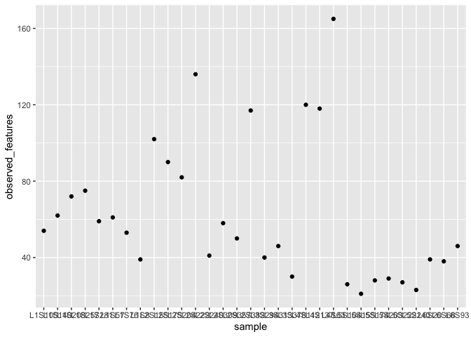
Let’s create a very simple plot based on the observed_features data.
ggplot(alpha_diversity) +
  geom_point(aes(x=sample,y=observed_features))
What’s going on in this command?
There are two parts. The first part creates a coordinate system and adds the data we will use for the plot. This is the first layer in the plot. It is very boring because we haven’t yet added a layer with geometric objects.
ggplot(alpha_diversity)

Add a layer with geometric objects of type “point”. Try it like this first?
ggplot(alpha_diversity) + geom_point()
Question: Why are we getting this error? What information do we need to know about each point before we can actually draw it?
In this case x and y are required aesthetics because there is no way
to draw a point without them.
The following principles apply whenever you add aesthetics.
- aesthetics are typically not fixed values. They are mappings between columns in the data and properties of geometric objects.
- You always use the
aes()function to create them.
ggplot(alpha_diversity) + geom_point(aes(x=sample,y=observed_features))

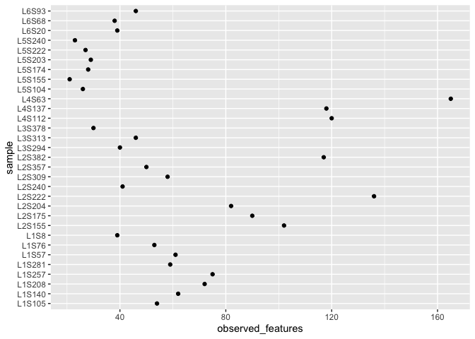
This plot looks pretty ugly because the sample labels are plotted over each other. There are several solutions to this but to keep things simple for now we will use a simple one. Just swap coordinates with coord_flip()
ggplot(alpha_diversity) + geom_point(aes(x=sample,y=observed_features)) + coord_flip()
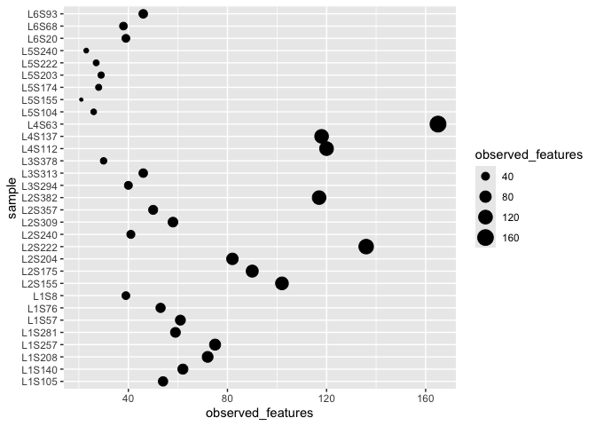
Optional aesthetics also exist .. things like colours, size etc. Not very meaningful but we could do this.
ggplot(alpha_diversity) + geom_point(aes(x=sample,y=observed_features,size=observed_features)) + coord_flip()
Layers
So far we have a base plot (with a coordinate system and data) and have added a single layer containing points. ggplot lets you add more layers. So we could represent our data using both points and bars like this
ggplot(alpha_diversity) +
  geom_col(aes(x=sample,y=observed_features)) +
  geom_point(aes(x=sample,y=observed_features,size=observed_features)) +
  coord_flip()
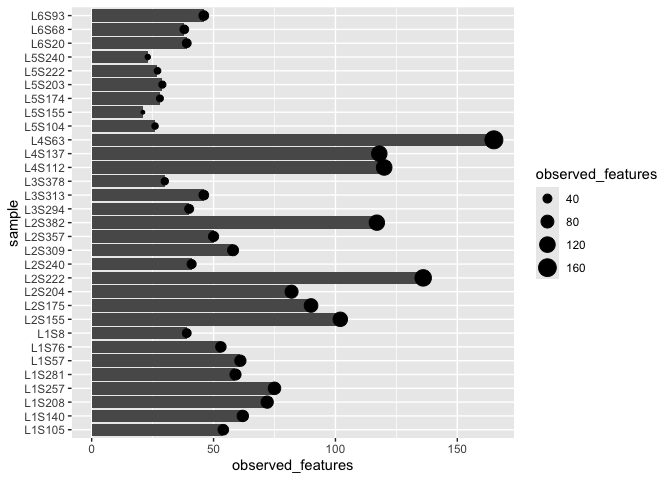
Is this actually a good idea?
To make a more informative plot we need to bring in some more data.
Wrangling
Our goal was to bring more data into play for our plot. Up to now we have just had sample labels but have not made use of the information that goes along with those labels. This is the sample metadata.
Start by reading the metadata. Turns out this is slightly challenging to
read because the second line contains information that we want to
ignore. We can do this using the comment option in read_tsv
meta_data <- read_tsv("sample-metadata.tsv",comment = "#q")
Notice that the name of the sample column is different here. In our
other dataset it was called sample but here it is called sample-id.
To make these names the same we will use the dplyr function rename().
One way we could do this would be
cleaned_meta_data <- rename(meta_data,sample=`sample-id`)
That worked but it wasn’t very elegant because we had to do it in a separate step and had to create a new variable unneccesarily.
A better way would be to use a pipe to do the reading and the transform in one step
meta_data <- read_tsv("sample-metadata.tsv",comment = "#q") %>%
  rename(sample=`sample-id`)
Joining data.
Now we join the data together using the left_join function. Again this
can be done with a pipe.
alpha_diversity_meta <- alpha_diversity %>% left_join(meta_data)
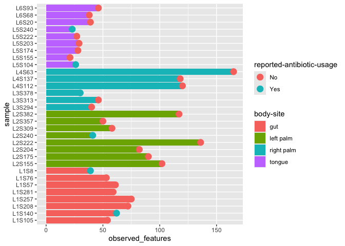
More interesting plot
Now we have a new dataset that contains our alpha diversity metric as well as a whole bunch of other information about each sample.
Let’s revisit the barplot.
ggplot(alpha_diversity_meta) +
  geom_col(aes(x=sample,y=observed_features,fill=`body-site`)) +
  geom_point(aes(x=sample,y=observed_features, color = `reported-antibiotic-usage`), size=4) +
  coord_flip()