BC3203
Coding Lecture 5
Load tidyverse packages
library(tidyverse)
Pipes
Start with a very simple pipe example
x <- c(1,1)
sum(x)
Wow!, 1 + 1 = 2
Equivalently this can be accomplished with a pipe
x %>% sum()
Let’s write our own function to work with a pipe
triple <- function(x){
  c(x,x,x)
}

# Try it out

triple("Hello")
Let’s try piping
# 3 Dogs
"dog" %>% triple()
Question How many dogs will I get from this line of code?
"dog" %>% triple() %>% triple()
Don’t manually count them. Pipe!
"dog" %>% triple() %>% triple() %>% length()
Here’s what this code would look like without using pipes
length(triple(triple("dog")))
The pipe is clearly much easier to read.
Visualising beta diversity
This time we will examine beta diversity metrics.
First download beta diversity data. We will start with the raw jaccard distance matrix
wget https://docs.qiime2.org/2023.5/data/tutorials/moving-pictures/core-metrics-results/jaccard_distance_matrix.qza
Next we use the qiime to export the data from a qiime zip archive
(qza) format to a simple tab separated text file (tsv).
qiime tools export --input-path jaccard_distance_matrix.qza --output-path jaccard_distance_matrix
The tsv file can be imported using read_tsv() from the readr
package.
jac <- read_tsv("jaccard_distance_matrix/distance-matrix.tsv")
After running the import take a look at the data in RStudio. Remember that it is a distance matrix so we expect it to have an equal number of rows and columns (square matrix). The value in each cell should be the jaccard distance between the samples corresponding to that row-column pair.
This dataset is not tidy! We’re going to tidy it but first we’ll make a
quick heatmap using the non-tidyverse function heatmap. Heatmaps are a
useful way of visualising data in matrix form.
The heatmap() function takes a matrix as its argument. So let’s
change our import command so that it produces a matrix
jac_dm <- read_tsv("jaccard_distance_matrix/distance-matrix.tsv") %>%
  column_to_rownames("...1") %>%
  as.matrix()
A few things to note:
column_to_rownames()was needed because matrices support one data type only. In this case numericas.matrix()converts the tibble into a matrix at the end.
heatmap(jac_dm)
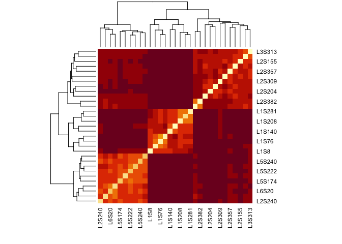
Making a heatmap allows us to see that there seem to be at least three separate blocks of samples, each of which is relatively closely related to each other (darker colors).
While it was easy to make this heatmap it is (unfortunately) more difficult to extend it. What we’d like to do for example would be highlight samples according to metadata so that we could discover what is driving the three groupings.
Heatmaps are one of the few plot types not supported by ggplot. An
excellent (though somewhat complex) package for making very high quality
heatmaps is ComplexHeatmap available from Bioconductor. We won’t be
covering this package as it is really only useful for heatmaps and takes
quite a bit of time to learn.
Clustering to form a tree
A natural representation of distance matrix data is the tree based on
hierarchical clustering. The hclust function in R can be used to
perform this operation. To use it first need to convert the distance
matrix into a special R object of type dist.
jacc_dist <- dist(jac_dm)

jacc_clust <- hclust(jacc_dist)
The best way to plot trees in R is using a package called ggtree. We
don’t have time to cover that package here but can easily make a simple
plot using the base-R plot function.
plot(jacc_clust)
The explore this further we need the metadata. First download it
wget "https://data.qiime2.org/2023.5/tutorials/moving-pictures/sample_metadata.tsv" -O sample-metadata.tsv
Remember from last week’s lecture that the sample metadata could be read like this;
sample_data <- read_tsv("sample-metadata.tsv",comment = "#q") %>%
  rename(sample=`sample-id`)
Now we can show the cluster labels according to body site. Notice how cumbersome this is in base-r compared with ggplot.
sample_body_sites <- sample_data$`body-site`
names(sample_body_sites) <- sample_data$sample

plot(jacc_clust,labels = sample_body_sites[jacc_clust$labels])
Multidimensional Scaling
Another way to visualise beta diversity is using an MDS plot. We can use
the cmdscale function in R to perform MDS based on a distance object
jacc_mds <- cmdscale(jacc_dist) %>%
  as.data.frame() %>%
  rownames_to_column("sample")

jacc_mds %>% ggplot(aes(V1,V2)) + geom_point()
Adding metadata is easy
jacc_mds_meta <- jacc_mds %>% left_join(sample_data)

jacc_mds_meta %>% ggplot(aes(V1,V2)) + geom_point(aes(color=`body-site`))
Tidying
Now let’s convert the data to tidy format. First let’s consider why the distance matrix is “not” tidy. Consider the definition of tidy data;
- Each variable is in a column.
- Each observation is a row.
- Each value is a cell.
The first two of these criteria are not satisfied. Each row actually
contains multiple observations. There are two variables which we will
call sample1 and sample2. Although sample1 is in its own column
sample2 is spread across multiple columns.
jac_tidy <- read_tsv("jaccard_distance_matrix/distance-matrix.tsv") %>%
  rename(sample1=`...1`) %>%
  pivot_longer(-sample1,names_to = "sample2",values_to="jaccard")
Optional Section
IMPORTANT NOTE
This section demonstrates a range of data wrangling and plotting techniques. It focuses on getting the basic operations right but does not represent best-practice. Notice that no effort is made to label axes nicely, no captions are provided and in some cases the plots are not even particularly informative. When doing your metagenomics assignment you should not simply copy the plots in this section. For your assignment you should focus on the guidance given in lectures on scientific graphics and the instructions in your metagenomics assignment guide and report.
This section demonstrates some challenging plot types and non-standard ways of working with metagenomics data. It is entirely for your interest and will not be examined. You are not expected to know this material for exams or assignments.
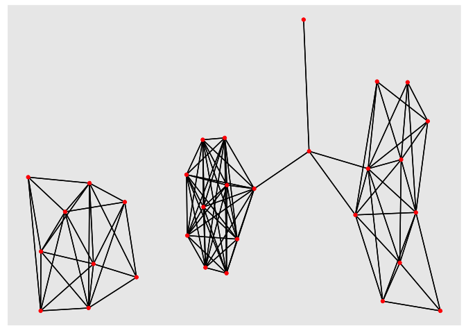
Network
After tidying the Jaccard data one potential way to plot it would be to consider the jaccard distances as defining a network. To make our network we say that;
- If sample1 and sample2 are separated by jaccard < threshold they are “connected”
- Otherwise sample1 and sample2 are “not connected”
To draw this we only want to consider connected samples. Use the
filter() function from dplyr to select only rows corresponding to
connections
jac_tidy_connected <- jac_tidy %>% filter(jaccard < 0.8)
We can draw networks using the ggplot extension, ggraph. This is quite nice because it seems to show that we have three separate groups of samples. Samples within the groups are highly connected but there are few connections between the groups.
library(ggraph)
library(igraph)

jac_graph <- graph_from_data_frame(jac_tidy_connected)
ggraph(jac_graph) + geom_edge_link() + geom_node_point(color="red")
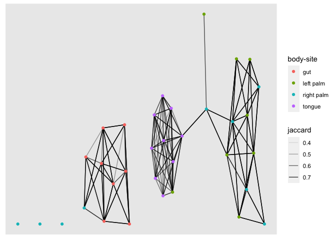
This provides us with metadata relating to the vertices in our graph. The ggraph package allows this to be added when constructing the graph. Now let’s plot the network again. This time colour the nodes according to the BodySite of sample1. We see that just using a simple jaccard distance threshold results in three (almost separate) sub-networks that separate gut, tongue and palm microbiomes.
jac_graph_meta <- graph_from_data_frame(jac_tidy_connected, vertices = sample_data)

ggraph(jac_graph_meta) +
  geom_edge_link(aes(edge_alpha = jaccard)) +
  geom_node_point(aes(color=`body-site`))
Visualising taxonomic composition
To create this visualisation we need several pieces of data
- A table with the abundance of each distinct sequence (feature) in each sample
- A table with the taxonomic classification for each feature.
Let’s download the abundance table
wget https://docs.qiime2.org/2023.5/data/tutorials/moving-pictures/table-deblur.qza
Then export it using qiime
qiime tools export --input-path table-deblur.qza --output-path table-deblur
This time the table is exported in biom format. We want it in tab
separated values so we need to perform an extra step
biom convert -i table-deblur/feature-table.biom -o table-deblur/feature-table.tsv --to-tsv
Now import the feature table
feature_table <- read_tsv("table-deblur/feature-table.tsv", skip = 1) %>%
  rename(feature_id = `#OTU ID`)
Question: Take a look at this table. Is it tidy?
library(tidyverse)
feature_table_tidy <- feature_table %>%
  pivot_longer(-feature_id,names_to = "sample_id",values_to = "count")
Next let’s get the taxonomy data.
wget https://docs.qiime2.org/2023.5/data/tutorials/moving-pictures/taxonomy.qza
qiime tools export --input-path taxonomy.qza --output-path taxonomy
Next we read in the taxonomy data
taxonomy <- read_tsv("taxonomy/taxonomy.tsv") %>%
  rename(feature_id = `Feature ID`)
Now for a tricky part. We’re going to use a tidyverse function called
separate_rows for this. Our aim is to tidy the Taxon column. This is a
tricky multi-step operation because that column encodes considerable
information.
The taxon entries look like this
k__Bacteria; p__Bacteroidetes; c__Flavobacteriia; …
We want to split them up by the separator “;” and each time we split we
want a new row to be created. This is what the separate_rows function
does.
taxonomy_tidy <- taxonomy %>% separate_rows(Taxon,sep = ";")
Look at the result. Now each taxonomic level is on a separate row. It’s getting tidier but isn’t completely tidy yet. Look at each entry
k__Bacteria
This says that the “Kingdom” is “Bacteria”. So we actually have two variables in a single column here. The taxonomic level is “Kingdom” and the classification itself is “Bacteria”.
This time we need to separate again, but we want to make new columns not
new rows. For this we use separate.
We extend our original pipe to add a new operation
taxonomy_tidy <- taxonomy %>%
  separate_rows(Taxon,sep = ";") %>%
  separate(Taxon,into = c("level","classification"),sep = "__", fill = "right")
Some entries have a level but no classification which leads to missing values.
We just eliminate those with a filter operation.
We also need to cleanup some whitespace in the level values
taxonomy_tidy <- taxonomy %>%
  separate_rows(Taxon,sep = ";") %>%
  separate(Taxon,into = c("level","classification"),sep = "__") %>%
  filter(classification!="") %>%
  mutate(level=str_trim(level))
Joining things together
Now we are ready to join the taxonomy and the feature table data together
taxa_features_tidy <- taxonomy_tidy %>% left_join(feature_table_tidy)
Creating summaries for plotting
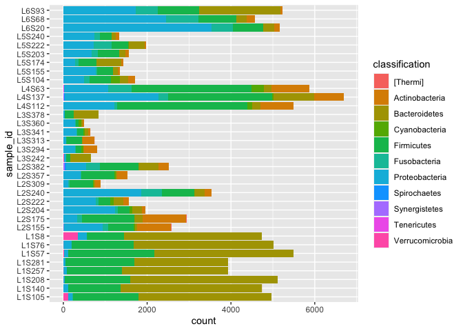
We want to make barcharts where taxonomic composition is shown for each sample summarised at a certain taxonomic level (eg Kingdom, Phylum, etc).
Let’s try phylum
phylum_data <- taxa_features_tidy %>%
  filter(level=="p") %>%
  group_by(sample_id,classification) %>%
  summarise(count=sum(count)) %>% na.omit()
ggplot(phylum_data) + geom_col(aes(x=sample_id,y=count,fill=classification)) +
  coord_flip()