BC3203
Goal
Learn to use R according to the Tidyverse philosophy. In this tutorial the goal will be to gain familiarity with core tidyverse packages. Specifically we will;
- Learn how to read datasets into
Rwith functions from thereadrpackage - Learn how to manipulate and summarize tabular data with functions from the
dplyrpackage - Learn how to create simple plots with the
ggplotpackage
Setting up, completing the assessment and running the tests
Many of the questions in this set of exercises will ask you to write an R command to import data at a specific path. Unlike previous R tests these don’t require you to wrap your answer in a function. So for example, if asked to write a command to read the file at path data/hox.tsv you could answer simply like this
read_tsv("data/hox.tsv")
## # A tibble: 6 × 8
##   GeneID       protein_name       `133hpf` `29hpf`    Egg    t12h    t2h    t72h
##   <chr>        <chr>                 <dbl>   <dbl>  <dbl>   <dbl>  <dbl>   <dbl>
## 1 1.2.1045.m1  Homeobox protein …   0.0328 -1.44   -1.67   2.55   0.259   1.27
## 2 1.2.1655.m1  Homeobox protein …   0.0221 -0.204  -0.258  0.260  0.0283  0.386
## 3 1.2.20276.m1 Homeobox protein …   0.0319 -0.364  -0.340  0.359  0.0426  0.540
## 4 1.2.20289.m1 Homeobox protein …   0.0207  0.0845 -0.172  0.0567 0.0425  0.0746
## 5 1.2.21324.m1 Homeobox protein …   0.628  -0.681  -0.652 -0.0238 0.867  -0.126
## 6 1.2.25539.m1 Homeobox protein …   1.27   -1.50   -1.57   0.737  1.23    0.681
If you want to test your answer you can simply run this code and compare the result with the benchmark data. For this tutorial some of the questions require you to match outputs from your code with some expected output (like a benchmark dataset). You can view the expected outputs for all questions at https://bc3203.bioinformatics.guide/2025/tutorials/04/expected_outputs
Guide
Background : The tidyverse
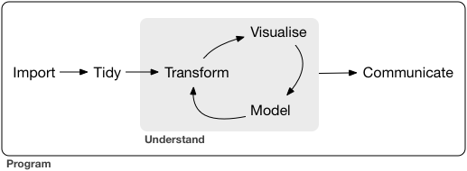
There are many ways of working with tabular data in R. In this tutorial we will primarily use a suite of packages called the tidyverse.
Tidyverse packages are designed to work together to offer a complete workflow for data. The steps in this workflow are illustrated below. They capture the essential elements of what bioinformaticians (and other data scientists) do. In this tutorial we will focus on the elements required to create a plot from a small gene expression dataset.
Two of the authors of tidyverse packages wrote an excellent book, R for Data Science which is available free online. Many of the R packages and programming concepts you will encounter in this subject are covered in greater detail in that book.
Loading the package
Since the tidyverse packages are designed to work together they are also bundled together as a collection, called tidyverse. Make sure you load the tidyverse by putting this line of code at the top of scripts or RMarkdown documents.
library(tidyverse)
Basic Data Import
Start by importing some data. This can be somewhat confusing because there are a large number of different functions for reading data available. The functions you are most likely to need are listed below.
| Function | Data Type | Package |
|---|---|---|
| read_csv() | Comma separated (CSV) files | readr |
| read_tsv() | Tab separated (TSV) files | readr |
| read_tabular() | Whitespace delimited files | readr |
| read_delim() | General delimited files | readr |
| read_excel() | Excel spreadsheet files | readxl |
| read.csv() | Comma separated (CSV) files | utils (Base R) |
| read.delim() | Tab separated (TSV) files | utils (Base R) |
| read.table() | General delimited files | utils (Base R) |
When working with csv and tsv files your default choice should be read_csv() or read_tsv().
This tutorial comes with several small example datasets to let you practise reading data. These are located in the data directory and are named hox[1-4].*. They are gene expression datasets for coral Homeobox genes. Homeobox genes are a group of transcription factors (they regulate expression of other genes) and are best known for their role in developmental patterning. The data is actually a small subset of a much larger experiment conducted on Orpheus Island in 2016 in which gene expression was measured across thousands of genes at many stages during development of corals from Eggs through to settled polyps.
If you are curious you can view the full dataset using this interactive data viewer which was developed using shiny, a web development framework for R.
The first dataset in this tutorial can be read as follows;
hox <- read_tsv("data/hox.tsv")
You will know that this worked because a new dataset called hox will appear in your Environment viewer in RStudio. After you read the data always take a moment to inspect it. You should check to make sure that the correct number of rows and columns are present and that the column names (if present) are correct.
Notice that when you ran the function above it produced quite a bit of output telling you that it managed to automatically figure out the column names. This “noisy” output can get in the way. You can stop readr from doing this by explicitly telling it to use the inferred column types as follows;
hox <- read_tsv("data/hox.tsv", show_col_types = FALSE)
If you get tired of setting this option everytime you call a readr function can you also set it globally as follows;
options(readr.show_col_types = FALSE)
Exercises 1-3 require you to read different datasets using one of the tidyverse data reading functions read_tsv(), read_csv() and read_excel().
Use the following steps to figure out the right way to read each dataset.
- Look at the file extension. It often tells you the data format
- Try reading the data using the basic command (ie with no options, just telling it the path to the file). If this works then you are done.
- If step 2 didn’t work you might need to inspect the data to see if it has some special issues. For example the data might have extra information at the top that is not tabular and needs to be skipped. You might need to provide extra optional arguments to the read command to get it to read properly. Use the
headcommand (on the command-line .. ie inbash) to inspect the first few lines of the input file. This will often reveal issues that need to be solved. - Once you have identified the appropriate read command (or you think you have) try carefully reading its documentation (ie its help page) to look for optional arguments that might help you customise the way you read in the data. Remember, to view help for a function use
?orhelp(). Eg
?read_tsv
Stop: Answer questions 1-3 in the exercises before reading further
Dealing with badly formatted or missing data
The next example dataset, data/hox4.tsv is an example of what can go wrong when the data has been hand edited. Unfortunately this kind of issue is very common. Learning how to deal with badly formatted data is an important skill. To see the problem let’s try reading the dataset with read_tsv()
hox4 <- read_tsv("data/hox4.tsv")
This doesn’t produce any errors so you might think it worked fine. Look at the data in the RStudio dataset viewer. You should see that there is a - in place of one of the numbers in the t2h column. Maybe someone hand edited the data and decided that - was a good way to represent a missing value? Unfortunately when R sees a non numeric value like - it doesn’t automatically know that this is a missing value. What it does instead is converts the entire column into character format rather than numeric. This is definitely not what we want since we will almost certainly want to do some calculations on those numeric values. The following code illustrates ways to investigate the problem. Try running these lines of code yourself to investigate.
hox4 <- read_tsv("data/hox4.tsv")

# This works fine.  Calculates the column means
colMeans(hox[3:7])

# This doesn't work.  It complains that x must be numeric.
colMeans(hox4[3:7])

# If we test for class on the problem column we see that it is of type character.
class(hox4$t2h)

# Printing the column also shows the issue.  The values are surrounded with quote marks indicating that they are character strings
hox4$t2h

# And of course, if we had not turned off the column type messages we could see immediately that column t2h is of type character which it should not be.
hox4 <- read_tsv("data/hox4.tsv",show_col_types = TRUE)
Stop: Answer question 4 in the exercises before reading further
Tibbles and data.frames
The hox data is a rectangular table. After reading in this data it exists in R in a form called a tibble. If you assigned it to a variable it will show up in the Environment window in RStudio. If you haven’t done so already click the hox dataset in RStudio to open a viewer window that shows the table in nicely viewable form.
R has several other ways of representing tables of data. The main ones are the data.frame and the matrix but there are others such as the data.table. One of the unfortunate consequences of having so many different types is that confusion about which type you are working with can lead to frustrating errors.
Here is a very quick summary of the three main types;
| Tabular Data Type | Characteristics | Where used |
|---|---|---|
matrix |
All elements must be the same type | Often used by mathematical functions for speed |
data.frame |
Each column can be a different type | Widely used outside the tidyverse |
tibble |
Much like a data.frame but doesn’t use row names, is less strict about column names and has more consistent subsetting behaviour |
Used throughout the tidyverse |
Tibbles behave a lot like data.frames and you can easily convert between them. For example;
This code creates a tibble
tbl <- tibble(x=1:5,y=letters[1:5])
This converts it to a data.frame
df <- as.data.frame(tbl)
And this converts it back
tbl_converted <- as_tibble(df)
For a deeper look at these differences you should read over this page
Subsetting
Accessing precise subsets of a tibble or data.frame is relatively easy.
Square backet notation can be used to specify rows and columns. For example to access the item in row 2 and column 3
hox[2,3]
To access a whole column you can address it by name;
hox$Egg

# Or like this
hox[,"Egg"]
Both rows and columns can be addressed by their number.
# The first row
hox[1,]

# The second column
hox[,2]
Let’s calculate some simple summary statistics on the hox data. For example we could use the colMeans() function to calculate the column means.
Try the code below. Why doesn’t it work?. See if you can modify the command to make it work.
colMeans(hox)
Stop: Answer questions 5 and 6 in the exercises before reading further
Wrangling
Raw data is almost never in exactly the form that you need to be for visualisation, plotting or statistical analysis. Often the majority of work in a bioinformatics project consists of tidying the data ( sorting it, making sure it has the right row and column structure) and transforming it ( computing new variables or summary statistics ). The book R for Data Science describes the overall process like this;
Together, tidying and transforming are called wrangling, because getting your data in a form that’s natural to work with often feels like a fight!
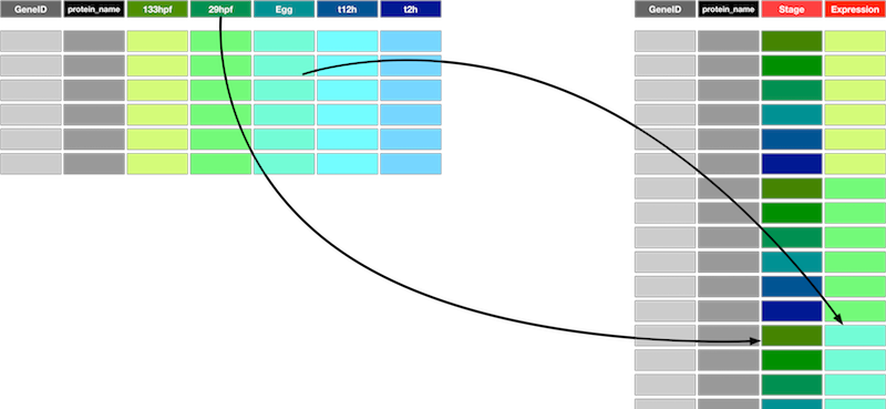
Our goal is to be able to plot the expression values for each gene as a function of developmental time stage. The developmental stages are the column names for the numeric columns in the data. Although this form for the data is easy for humans to look at it, it is actually much less suitable for data exploration. Why is this an unsuitable format? The main issue is that there are multiple observations in each row. As a consequence of this one of the key variables (developmental stage) does not have its own column. Instead, developmental stage is represented by the column names on columns 3-8.
To fix this problem we need to reshape the data. Our data is currently Wide and we need to make it Long. Specifically we need to create two new columns, one of which will hold the developmental stages (previously column names) and the other will hold the expression values for each combination of developmental stage and the original rows (one for each gene). This new form isn’t the most compact representation. In fact it duplicates values from the existing columns GeneID and protein_name but it is far easier to work with for visualisation and data exploration.
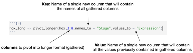
The function to transform from wide to long is called pivot_longer(). To pivot the hox data into long form we do the following;
hox_long <- pivot_longer(hox,3:8,names_to = "Stage",values_to = "Expression")
Look carefully at the pivot_longer() command here. The image below shows the most important arguments and what they do;
Experiment with the pivot_longer command to get a feel for what the arguments do
- Try changing the columns to be pivoted? What happens if you use columns 4:8 instead of 3:8?
- Try changing
names_toandvalues_to?
To transform back (from long to wide) we use the function, pivot_wider(). For the hox data we would do this;
hox_wide <- pivot_wider(hox_long,names_from = Stage,values_from = Expression)
Notice the symmetry of these two functions. The column names created in pivot_longer() are referenced in pivot_wider() to determine where names and values should be derived from.
Stop: Answer questions 7 to 9 in the exercises before reading further
Metadata
Our ultimate goal will be to plot expression for each gene across developmental stages. One problem with the current dataset is that the stages are named in a rather ad-hoc way. The names don’t allow us to easily figure out the correct ordering of the stages, which should logically be according to time since fertilization. To fix this we need to bring in some more data. This is also a common step in data wrangling since information about the samples (stages in this case) is often kept in a separate file from the measurements themselves. Now that our data is in long format it is possible to merge this metadata with the measurements to form a single dataset.
Read the metadata as follows;
stage_metadata <- read_tsv("data/stage_data.tsv", col_types = cols())
This dataset has just two columns Stage and hpf. hpf stands for “Hours post fertilization”
Notice that the metadata is not arranged in numerical order according to the value of hpf. We can fix that with the arrange() function. Unfortunately there is more than one arrange function so to get help on it you need to provide the package name like this
?dplyr::arrange
Stop: Answer question 10 in the exercises before reading further
Now merge the stage_metadata with the hox_long data. To do this we use one of the tidyverse data joining functions. In this case we use the function left_join() which keeps all the rows from its first argument and adds columns by finding matches with its second argument. This works because both datasets have a column called Stage which is used to find matching rows.
hox_long_meta <- left_join(hox_long,stage_metadata, by = "Stage")
Stop: Answer question 11 in the exercises before reading further
Plotting
We will use the ggplot2 package for plotting. Unlike most plotting frameworks which provide a suite of different methods for creating different types of plots, ggplot2 does all of its plotting through a single unified system. This system not only allows you to create a wide range of publication quality plots, it is designed to facilitate data exploration. In particular it allows you to control the appearance of the plot based on attributes in the data and this in turn allows you spot patterns that might otherwise be invisible.
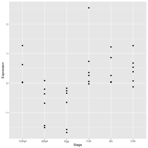
Let’s start by creating a simple scatter plot from the hox gene expression data.
ggplot(hox_long_meta) + geom_point(aes( x = Stage, y = Expression))
To create a plot with ggplot you always start with the ggplot() command itself. This creates the basic plotting object. In this case we include the data as input.
Next come the layers of the plot. Since layers are added to a plot the + symbol is used to separate them. Usually these are created with functions with names like geom_(something). In the example above we added points using geom_point.
All geoms require you to specify a mapping between their aesthetics and values in the data. This is done using the aes function in the example. In the case of geom_point() the available aesthetics are;
| Aesthetic | Description |
|---|---|
x |
(Required) Position along the x axis |
y |
(Required) Position along the y axis |
alpha |
Transparency of points |
colour |
Colour of points |
fill |
Fill colour (only for certain types of points) |
shape |
Shape of the points |
size |
Size of the points |
stroke |
Stroke size for certain point types |
Notice that the first two aesthetics x and y are required. This should make sense since you can’t plot a point if you don’t know where to put it. All the other aethetics have default values so they are optional.
You can set aesthetics specifically for each geom or you can include them in the ggplot call so they apply to all geoms. The following code produces the same plot as above. If you are going to use more than one geom (see below) this is a more succinct way to write your code.
ggplot(hox_long_meta,aes( x = Stage, y = Expression)) + geom_point()
Improving the plot
There are several problems with the plot so far. The first is that the stages are no longer in the correct order. We can fix this by using the reorder() function to explicitly order stages according to the value of hpf.
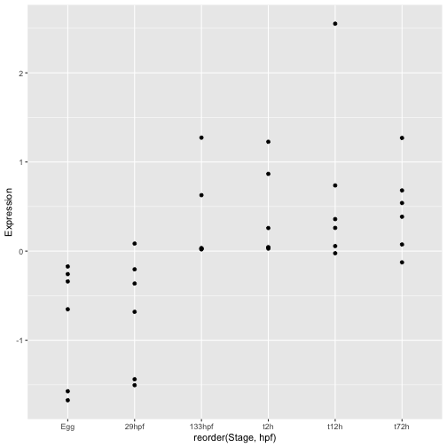
ggplot(hox_long_meta, aes( x = reorder(Stage,hpf), y = Expression)) + geom_point()
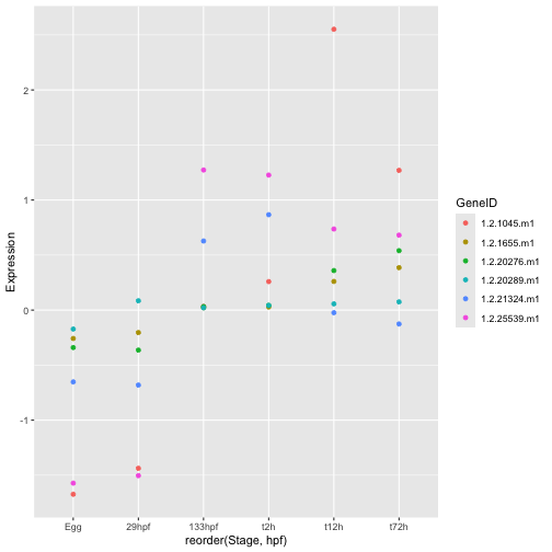
The next problem is that there is no way to tell which points belong to each gene. We can see some general trends even without this information but it would be much more useful to plot expression on a gene by gene basis. This is where all our wrangling work pays off. Since the GeneID is a column in our data we can ask ggplot to change the plot appearance based on its value. More specifically, we can set the aesthetic appearance of points to depend on GeneID
Let’s start by simply colouring the points.
ggplot(hox_long_meta, aes( x = reorder(Stage,hpf), y = Expression)) + geom_point(aes(color=GeneID))
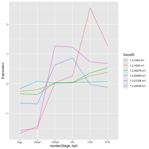
This is already much better but it is hard to see the trajectory of each gene. Maybe a line plot would be better. To accomplish this we switch to a different geom. The geom defines the fundamental type of objects that are drawn to represent the data. ggplot has a huge list of geoms all of which can be found in the ggplot reference manual. I strongly encourage you to browse the list and play around. Remember that only certain geoms will make sense with any particular dataset though.
ggplot(hox_long_meta, aes( x = reorder(Stage,hpf), y = Expression)) + geom_line(aes(group=GeneID, color=GeneID))
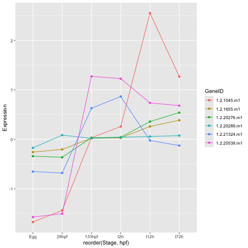
Geoms are built up in layers. If you look at each of the ggplot commands so far you will see that the + symbol is used to separate the main ggplot() command from commands like geom_* which add layers. So there is nothing stopping us from including both geom_point() and geom_line();
ggplot(hox_long_meta, aes( x = reorder(Stage,hpf), y = Expression)) +
  geom_line(aes(group=GeneID, color=GeneID)) +
  geom_point(aes(color=GeneID))
Another way we could make it easier to spot the trajectory for each gene would be to have each on its own mini plot. This is accomplished using facetting
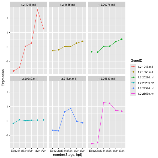
ggplot(hox_long_meta, aes( x = reorder(Stage,hpf), y = Expression)) +
  geom_line(aes(group=GeneID, color=GeneID)) +
  geom_point(aes(color=GeneID)) +
  facet_wrap(~GeneID)
Stop: Answer question 12 in the exercises before reading further
Exercise (Not Assessed)
Keep playing with the plot of hox genes. In particular see if you can figure out how to do the following;
- Make the shape of points used for
geom_point()dependent onGeneID - Try
geom_boxplot()does this also work with geom_point()? What about geom_line()? - Try
geom_violin,geom_dotplot() - Are there any geoms that don’t work with this dataset? Can you figure out why they don’t work or won’t make sense?
- Can you figure out how to change the labels on the axes using
xlab()andylab()