BC3203
Goal
In the previous tutorial we worked through importing and reshaping a single dataset. In this tutorial we will repeat the process with a range of different datasets and will also place a heavy emphasis on plotting. Gaining experience in dealing with a range of datasets is important especially at the wrangling step because;
tidy datasets are all alike but every messy dataset is messy in its own way. (Hadley Wickham)
Unfortunately genomic datasets don’t make great examples for learning the basics. We will therefore start with some economic and sociological data. In your major assignment you will use the same skills to create plots based on metagenomic data from the qiime moving pictures dataset.
Prior Reading and Reference Material
If you would like more practice with data wrangling from the previous coding assignment, or with plotting (in this one) you will probably benefit from reading the following sections from the book R for Data Science;
You might also want to read and try the examples on this page which describes the dplyr package which we will use extensively in this tutorial.
Finally, you may also want to download and print the Data transformations with dplyr cheat sheet which is a handy reference to have available during the tutorial.
Completing the assessment and running the tests
There are several question types in this tutorial. Pay attention to the question and make sure you respond appropriately. Questions may ask you to;
- Write a function. Make sure you write your answer as a function, and use the correct name and arguments
- Write some code. In this case just write bare code (not in a function)
- Write code to produce a plot. Again, just write your code
Each question will be tested independently so make sure you include all the code you need to answer each question in the answer block provided.
Many of the questions in this set of exercises will ask you to write an R command to create a plot. Be sure to look carefully at the expected plots. Details like axis names, legends and scales should all be the same. Automated tests will attempt to compare your plot with the expected result. They will only pass if the plot is very close or identical to the original.
Guide
The Gapminder Dataset
The gapminder data is a rich source of information on global development. It is sufficiently well known and useful that it has its own R package. To access the gapminder data we load its package.
library(gapminder)
The gapminder package is a special type of package called a data package. After loading the package using the line above we now have access to a new dataset;
gapminder
## # A tibble: 1,704 × 6
##    country     continent  year lifeExp      pop gdpPercap
##    <fct>       <fct>     <int>   <dbl>    <int>     <dbl>
##  1 Afghanistan Asia       1952    28.8  8425333      779.
##  2 Afghanistan Asia       1957    30.3  9240934      821.
##  3 Afghanistan Asia       1962    32.0 10267083      853.
##  4 Afghanistan Asia       1967    34.0 11537966      836.
##  5 Afghanistan Asia       1972    36.1 13079460      740.
##  6 Afghanistan Asia       1977    38.4 14880372      786.
##  7 Afghanistan Asia       1982    39.9 12881816      978.
##  8 Afghanistan Asia       1987    40.8 13867957      852.
##  9 Afghanistan Asia       1992    41.7 16317921      649.
## 10 Afghanistan Asia       1997    41.8 22227415      635.
## # ℹ 1,694 more rows
Income vs Life Expectancy
Our goal in this section will be to produce plots like this one;
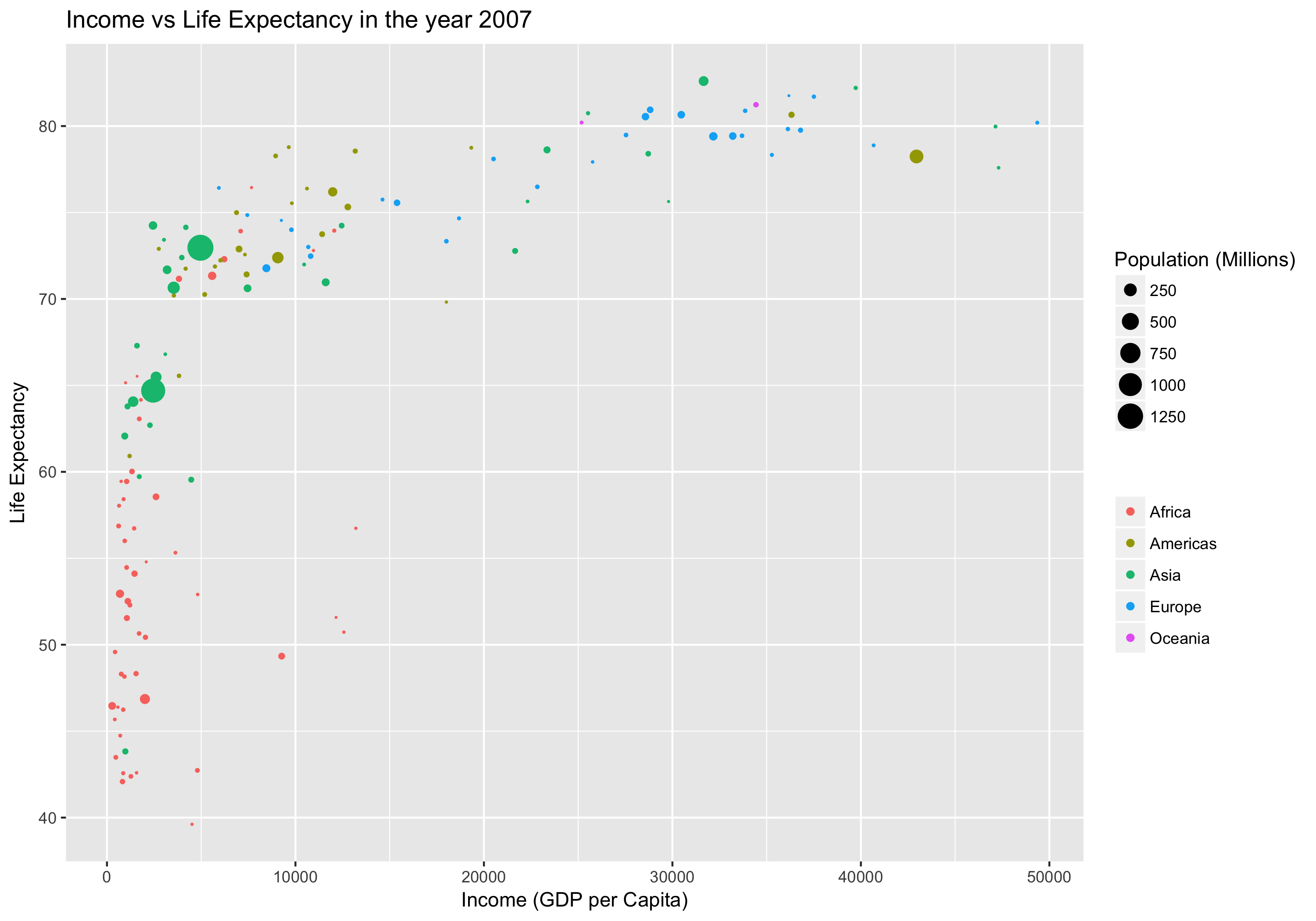
Don’t worry if you can’t see how to make this plot yet. We will work up to it in steps.
Filtering with filter()
In order to make this plot we need to select rows in the data matching the year 2007. We can do this using the filter() function as follows;
gapminder_2007 <- filter(gapminder, year==2007)
(Side Note) Pipes in R
Remember the command line pipe operator |. We used this often on the command line to chain together programs. Pipes in R work much the same way as they do on the command line but they use %>% instead of |. Remember that a pipe takes the output of the command on the left of the pipe and uses it as input for the command on the right.
We could filter the gapminder data with a pipe like this;
gapminder_2007 <- gapminder %>% filter(year==2007)
Can you see how this is working? Notice that when filter() is used in a pipe the first argument (the dataset) is omitted. This is because the pipe operator %>% takes the item on the left and inserts it as the first argument of the function call on the right.
Why would you want to use a pipe? In short, because it will make your code more readable and less likely to have mistakes. This is especially true when you write expressions with several pipes. The main benefits are;
- Chaining several commands into a pipe avoids creating intermediate datasets.
- Having to think up (and correctly refer to) unique names for all those intermediate datasets is a very common source of mistakes.
- Intermediate datasets distract from the message of the code and make it hard to read, whereas a nicely formatted pipe brings the focus onto the functions being called.
- The alternative to pipes and intermediate datasets is nested brackets, and this is even harder to read.
Creating new columns with mutate()
The gapminder data has columns gdpPerCap (GDP Per Capita) and pop (Population). We could compute a new column with the total GDP by multiplying these two. We do this with the mutate() function as follows;
gapminder_gdp <- gapminder %>% mutate(gdp = gdpPercap*pop)
Stop: Answer question 1 in the exercises
Using your answer to question 1 in a pipe
After you finish question 1 you should have defined a new function called gapminder_1972. Try playing around with your new function. First just try running it on the gapminder data.
gapminder_1972(gapminder)
Next try the same thing but using a pipe
gapminder %>% gapminder_1972()
Note that you can use your newly made function as part of a pipe along with other functions. For example you could filter for year 1972 and also create a gdp column using mutate like this
gapminder %>% gapminder_1972() %>% mutate(gdp = gdpPercap*pop)
Stop: Answer questions 2-3 in the exercises
Plotting with ggplot2
The basics of plotting with ggplot2 were covered in the lectures, Tidyverse 1 and Tidyverse 2. Remind yourself of how ggplot works by going over the code examples for those lectures.
If you are very new to ggplot you might also want to work through the data visualisation chapter in the R for data science book.
It is well worth taking the time to go through both those resources and running the example code.
Stop: Answer questions 4-7 in the exercises
The language of data manipulation
A wide range of data transformations can be performed using the dplyr package which is the core data transformation package in the tidyverse. The core functions in dplyr are;
filter()for picking rows by their valuesselect()for picking columns by their namesarrange()for reordering rowsmutate()for creating new columns based existing onessummarise()for collapsing many values down to a summarygroup_by()which changes the scope of the functions above so they work group by group
When preparing data for plotting or analysis it is common to chain several of these functions together. This is where we will really start to see the benefit of the pipe operator, %>%.
To practise using these functions we will use the starwars dataset which is built-in to the tidyverse package.
Start by viewing the data
starwars
## # A tibble: 87 × 14
##    name     height  mass hair_color skin_color eye_color birth_year sex   gender
##    <chr>     <int> <dbl> <chr>      <chr>      <chr>          <dbl> <chr> <chr>
##  1 Luke Sk…    172    77 blond      fair       blue            19   male  mascu…
##  2 C-3PO       167    75 <NA>       gold       yellow         112   none  mascu…
##  3 R2-D2        96    32 <NA>       white, bl… red             33   none  mascu…
##  4 Darth V…    202   136 none       white      yellow          41.9 male  mascu…
##  5 Leia Or…    150    49 brown      light      brown           19   fema… femin…
##  6 Owen La…    178   120 brown, gr… light      blue            52   male  mascu…
##  7 Beru Wh…    165    75 brown      light      blue            47   fema… femin…
##  8 R5-D4        97    32 <NA>       white, red red             NA   none  mascu…
##  9 Biggs D…    183    84 black      light      brown           24   male  mascu…
## 10 Obi-Wan…    182    77 auburn, w… fair       blue-gray       57   male  mascu…
## # ℹ 77 more rows
## # ℹ 5 more variables: homeworld <chr>, species <chr>, films <list>,
## #   vehicles <list>, starships <list>
Now try playing with different data manipulation functions. Here are some examples involving filter(), select(), arrange() and mutate().
We will cover group_by() and summarise() later.
# This retains only rows where height is greater than 90
starwars %>% filter(height > 90)

# This selects only columns name, height, species
starwars %>% select(name,height, species)

# This selects only columns ending in "color"
starwars %>% select(ends_with("color"))

# This selects columns ending in "color" and also the columns name and species
starwars %>% select(ends_with("color"), name, species)

# This sorts by height (smallest to largest)
starwars %>% arrange(height)

# This sorts by height (largest to smallest)
starwars %>% arrange(desc(height))

# This creates a new column called relative_height which is the height relative to the height of the tallest character
# Also selects columns so the new one is easily visible
starwars %>% mutate(relative_height = height/max(height, na.rm = TRUE)) %>% select(name, height, relative_height)
Stop: Answer questions 8-10 in the exercises
In questions 8-10 you would have written the functions add_bmi() and without_droids() you can use them in pipes. Try it out like this
starwars %>%
  without_droids() %>%
  add_bmi()
Notice how this code is highly readable. It almost reads like a normal sentence due to the use of careful function naming and the use of pipes.
Now use your functions to create a dataset for plotting
bmi_nodroid_data <- starwars %>%
  without_droids() %>%
  add_bmi()
Now create a basic plot of bmi by sex
ggplot(bmi_nodroid_data) + geom_point(aes(x = sex, y = bmi))
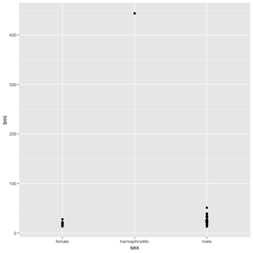
The plot doesn’t look very good for a few reasons. One of which is that there is a single hermaphrodite character with a very high outlying bmi. Let’s investigate to see who this is.
bmi_nodroid_data %>% filter(sex == "hermaphroditic")
Our interest is in broad patterns not outlying individuals so let’s make a function no_jabba() to remove this character.
no_jabba <- function(data){
  data %>% filter(sex != "hermaphroditic")
}
Let’s make the plot again without Jabba.
ggplot(bmi_nodroid_data %>% no_jabba()) + geom_point(aes(x = sex, y = bmi))
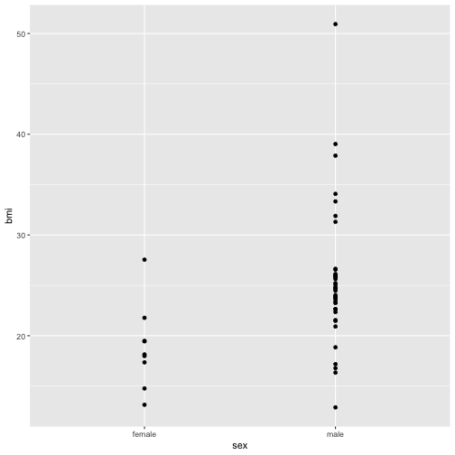
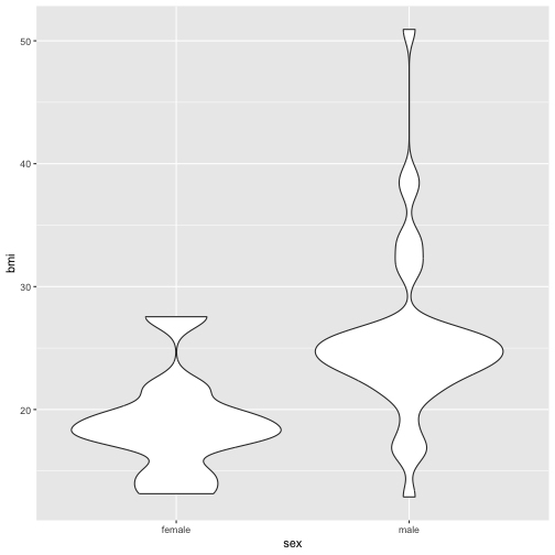
Now the plot is better but it is still not great. The problem now is that many points are plotted over the top of one another. This obscures patterns. One way around this would be to use an alternative geom that summarises the density of points. A good choice in this case is geom_violin. For more info about violin plots see this wikipedia entry.
ggplot(starwars %>%
         without_droids() %>%
         add_bmi() %>%
         no_jabba()) +
  geom_violin(aes(x = sex, y = bmi))
Grouping and summarising
Continuing with the starwars data let’s illustrate how to create summaries for particular groupings of the data. To accomplish this we need to combine group_by() with summarize(). For example to obtain the average (or mean) bmi by species
starwars %>%
  add_bmi() %>%
  group_by(species) %>%
  summarise(average_bmi = mean(bmi))
Notice that we used add_bmi again. This is necessary since we can’t calculate an average bmi without the bmi column. Also notice that the result of this operation removes all the columns except those related to the grouping (ie the grouping variables) and the columns that are generated as a result of the summarise() command.
In this next example we group by species and sex. Observe what this does to the number of rows in the output as well as the fact that a new column is also included in the output.
starwars %>%
  add_bmi() %>%
  group_by(species,sex) %>%
  summarise(average_bmi = mean(bmi))
## # A tibble: 41 × 3
## # Groups:   species [38]
##    species   sex    average_bmi
##    <chr>     <chr>        <dbl>
##  1 Aleena    male          24.0
##  2 Besalisk  male          26.0
##  3 Cerean    male          20.9
##  4 Chagrian  male          NA
##  5 Clawdite  female        19.5
##  6 Droid     none          NA
##  7 Dug       male          31.9
##  8 Ewok      male          25.8
##  9 Geonosian male          23.9
## 10 Gungan    male          NA
## # ℹ 31 more rows
The summarise function is not restricted to making a single summary. For example we might also want to know how many individuals go into calculating the average for each sex by species combination.
starwars %>%
  add_bmi() %>%
  group_by(species,sex) %>%
  summarise(
    average_bmi = mean(bmi),
    n = n()
  )
## # A tibble: 41 × 4
## # Groups:   species [38]
##    species   sex    average_bmi     n
##    <chr>     <chr>        <dbl> <int>
##  1 Aleena    male          24.0     1
##  2 Besalisk  male          26.0     1
##  3 Cerean    male          20.9     1
##  4 Chagrian  male          NA       1
##  5 Clawdite  female        19.5     1
##  6 Droid     none          NA       6
##  7 Dug       male          31.9     1
##  8 Ewok      male          25.8     1
##  9 Geonosian male          23.9     1
## 10 Gungan    male          NA       3
## # ℹ 31 more rows
So far we have used the functions mean() and n() to create summaries. You may be wondering which functions are available for this purpose. The answer is that almost any function which can take a column of data (ie a vector) and produce a single summary value can be used here.
Stop: Answer questions 10-14 in the exercises