BM3331 / BC5203
Goal
This guide walks you through a complete analysis of RNASeq data. It starts with downloading raw reads and reference data and works through alignment, quantification and differential expression analysis. It finishes by using the genomic locations of differentially expressed genes to pinpoint a region of the mouse genome that controls the production of NKT cells.
Like the metagenomics exercise, this is a formative exercise: nothing in it is graded, and there is nothing to submit.
The goal of this exercise is to provide you with a genuine opportunity to learn how to perform an RNASeq analysis through experience. You will be performing the same analyses that you learned about in lectures so this is an opportunity to make that theoretical knowledge concrete. If you engage with this exercise you are much more likely to remember the concepts needed for the exam and take home valuable skills for your future work.
To maximise the learning value from this exercise you should pause to reflect as you go through. After each step, ask yourself what did that step actually accomplish, and why was it necessary? The more you reflect and connect what you did with lectures and with the broader goals of the analysis the more you will learn.
Setup
You should receive a github invitation to your personal copy of the exercise github repository. Create a new project in RStudio by cloning it from github. This is the same procedure you used for the metagenomics exercise.
How this exercise connects to your lectures
Everything you do in this guide is an implementation of something covered in the gene expression lecture series. This consists of three parts: Measuring Gene Expression (lectures 6.x), The RNASeq Workflow (7.x) and Statistical Modelling of RNASeq (8.x). The lectures explain why each operation is necessary and what the alternatives are; this guide shows you what it looks like when you actually run it. Keep the relevant slides open alongside the guide.
| # | Lecture | Where it applies in this guide |
|---|---|---|
| 6.1 | Measuring gene expression | Steps 2 and 4 — genes, transcripts and isoforms in the gene models; the genes × samples shape of the count table |
| 6.2 | Applications of high throughput gene expression techniques | The experiment as a whole — using expression differences between two mouse strains to locate the gene(s) behind a trait (step 7) |
| 6.3 | High throughput gene expression methods | The whole guide in overview — extract RNA, sequence, align, count. Also why a study originally done with microarrays can be repeated with RNASeq |
| 6.4 | High throughput protein expression | Background only — nothing in this guide measures protein. Keep in mind at step 7 that a difference in mRNA does not guarantee a difference in protein |
| 7.1 | RNASeq Workflow | The whole guide in overview — steps 1–4 follow the workflow diagram from reads to counts |
| 7.2 | Types of reads used in RNASeq | Steps 1 and 3 — paired-end read files, --paired-end alignment, properly paired reads |
| 7.3 | How many reads do we need? | Steps 4–6 — why most genes have zero counts at 10k reads per sample, and what changes at 1M reads |
| 7.4 | RNASeq sampling design | Steps 1 and 4 — biological replicates of inbred mice, the sample table describing the experimental design |
| 7.5 | Read alignment | Steps 2–3 — choosing a reference, building the bowtie2 index, aligning reads, SAM/BAM files |
| 7.6 | Estimating read counts | Steps 3–4 — multi-mapping reads and secondary alignments, how RSEM resolves them, TPM versus counts in tximport |
| 8.1 | Statistical Analysis of RNASeq Data | Steps 4–7 in overview — the quantification table as input; data-driven discovery (step 5) versus testing a hypothesis (step 7) |
| 8.2 | Modelling count variability | Steps 4–6 — why counts are modelled with a negative binomial, and why genes with very few reads carry little information. Its worked example uses 10,000 reads, the depth of your first dataset |
| 8.3 | Between sample normalisation | Steps 4–5 — comparing count distributions between samples; the normalisation performed by DESeq() |
| 8.4 | Exploratory data analysis | Step 5 — using the PCA plot to find what explains variation and to spot outlying samples |
| 8.5 | Statistical Modelling of RNASeq Data | Steps 4–7 — the design formula ~mouse_type, the Wald test, statistical power, multiple testing and padj, volcano plots |
Keeping a reflection log
As with the metagenomics exercise, you should keep a reflection log as you work through this guide. Your repository contains a file called reflections.Rmd, structured to mirror the steps of the guide, where you answer both the coding questions and the reflection prompts. All of the advice on keeping a reflection log from the metagenomics guide applies here too.
One thing is different this time. Because most of this analysis happens in R, some reflection prompts will ask you to make a simple plot, for example to check the shape of a distribution or to compare two sets of results. Put the code for these plots in an r code chunk directly under the prompt in reflections.Rmd. Keep them quick and simple. The aim is to look at your data, not to produce publication quality figures.
Guide
The data for this exercise comes from an experiment by JCU researchers Margaret Jordan and Alan Baxter. The study used differences in gene expression between two strains of mice to identify a key signalling gene in proliferation of NKT cells. In the original study ( published in the Journal of Immunology ) microarrays were used to measure gene expression but in this exercise you will work with RNAseq data that has been simulated to mimic its results.
The two mouse strains are almost genetically identical. They differ only in a single region of the genome, called the congenic segment, and that region is responsible for the difference in NKT cell production between them. Steps 1–6 of this guide take you from raw reads to a list of genes that are differentially expressed between the two strains. In step 7 you use the genomic locations of those genes to work out where the congenic segment is. Keep this end goal in mind as you go.
How to complete this guide
You should approach this guide in the same way as you did for the metagenomics exercise. All of the advice on completing the guide that was given for that exercise also applies here. In addition, for this guide:
- Some steps include questions that ask you to write R code (eg Question 2.1). Write your answers in
reflections.Rmd, and try to answer them yourself before looking at the answers at the bottom of this guide. - Use
reflections.Rmdto keep track of the commands you run while completing the guide. While completing the guide take care to run commands in the appropriate way. Some of the given commands will beRcode and others will beBASH. ForRcommands you should enter them into an RMarkdown document inside anRcode block; ie a block starting with ```{r}. For bash commands you should enter them into the same RMarkdown document within aBASHcode block. In general you should make sure that none of the code in yourBASHcode blocks gets run when you knit your RMarkdown document.
When running commands for this exercise please note that some of the BASH commands will take a long time (~1 hour) to run and you will need to take special care to make sure those commands run all the way to completion. Do not run long BASH commands directly in RMarkdown code blocks. For those commands you submit them as batch jobs (as instructed in the guide).
Step 1: Download sequencing data
Raw data for this exercise consists of gzipped fastq files available on the web. All files have URLs that look like this;
https://s3-ap-southeast-2.amazonaws.com/bc3203/10k_reads/NNN_1_1.fq.gz
The first part of the URL (https://s3-ap-southeast-2.amazonaws.com/bc3203/) is constant.
The middle part of the URL is a folder name denoting the number of reads per sample used to generate the data. It can take values;
10k_reads100k_reads1M_reads
Begin by working with the smallest version of the data (ie 10k_reads). We will work with some of the large datasets later.
Run the code below to read this into R
Start by loading the tidyverse package.
library(tidyverse)
raw_files <- read_tsv("raw_data/raw_files.tsv", col_names = c("folder","file"))
Notice how this gives us an annoying message informing us about the column types that were inferred. If you are tired of seeing this message you can turn it off within an R session using the following code
options(readr.show_col_types = FALSE)
Within the 10k_reads folder there are 28 files (14 samples. 2 files per sample because these are paired-end reads). The example code below shows how to download a single file and save it locally to raw_data/10k_reads/.
First create the destination directory using the following command in BASH;
mkdir -p raw_data/10k_reads
Then run this R command to download the file;
download.file("https://s3-ap-southeast-2.amazonaws.com/bc3203/10k_reads/NNN_1_1.fq.gz",destfile = "raw_data/10k_reads/NNN_1_1.fq.gz")
Now take a look in the directory raw_data/10k_reads. You should see the file you downloaded, NNN_1_1.fq.gz.
Now extend this idea to automate downloading of all the files. Write R code to automatically download all 10k_reads files. Your code should;
- Save files using their original filenames (eg
NNN_1_1_fq.gz) - Save all files inside
raw_data/10k_reads - Only perform the download if the destination file does not exist
- Use programming abstractions such as functions and/or for loops to avoid repeating the same or similar code over and over.
Advice on writing functions and loops can be found in the guide to coding assignment 3.
Remember that downloading files takes time, disk space, and internet resources. This can be a problem if you are running code many times in order to troubleshoot a problem. Therefore, while you are writing your code you should use the following techniques to speed up the troubleshooting process;
- Only work with a small subset of files at first. Get those right and only run on all the files when everything is working
- Instead of using the
download.filefunction you should use the following function instead during debugging mode.
mock_download.file <- function(url,destfile){
  cat(paste("Downloading ",url," to ",destfile,"\n"))
}
This function has the same arguments as download.file but it just prints text rather than actually downloading. If you use this function you can quickly get the structure of your program right. Then when you are ready just replace the mock function with the real download.file function.
# Write code to download all the 10k files here.
# In step 6 you will adapt this code to download the much larger 1M reads files.
After the download is finished take a look at the files you downloaded. There should be 28 of them. The names of the files encode information about the experiment as follows;
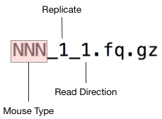
The experiment involves two mouse types, which are labelled NNN and NN respectively. These abbreviations stand for;
- NN : NOD.Nkrp1
- NNN : NOD.Nkrp1.Nkt1
Since this is a 10k_reads dataset we expect each file to contain around 10000 reads. As a rough check to ensure that the files downloaded properly we could simply list the number of reads in each file.
Here is some bash code to check an individual file;
gunzip -c raw_data/10k_reads/NN_1_1.fq.gz | grep '^+$' | wc -l
This bash code checks all the files. Read over this code and reassure yourself that you understand what it does. Then run the code by copy-pasting it into the terminal. It should print the name of each file followed by the number 10000 indicating that the file contains 10000 reads as expected.
for f in raw_data/10k_reads/*.gz;do
  echo $(basename $f) $(gunzip -c $f | grep '^+$' | wc -l)
done
Step 2: Download the mouse reference genome
In order to quantify gene expression we first need to align all our reads (in fastq files downloaded above) to a reference sequence. Since this is Mouse data a high quality reference genome is available from ENSEMBL. ENSEMBL maintains reference genomes for vertebrates as well as a small number of model invertebrate species.
Have a look at the ENSEMBL entry for mouse on the web at https://asia.ensembl.org/Mus_musculus/Info/Index. It has links to a wide range of genomic resources for Mouse research. Since the Mouse genome is very widely used it is under constant improvement and there are regular releases to reflect progress. It important to note the version and work consistently with a known version of the genome within the context of a particular project. We will use reference version 38, and will specifically be working with two files from this resource;
a. The Mouse genome Mus_musculus.GRCm38.dna.toplevel.fa.gz in fasta format b. Gene models for all known Mouse genes in GTF format Mus_musculus.GRCm38.82.chr.gtf.gz
To save time and disk space, these files are available from a shared folder on the RStudio online instance. If you are using the online rstudio run the bash commands below to create symbolic links from the shared files into your project raw_data directory.
ln -s /pvol/data/ensembl/Mus_musculus.GRCm38.82.chr.gtf raw_data/
ln -s /pvol/data/ensembl/Mus_musculus.GRCm38.dna.toplevel.fa raw_data/
If you are running this tutorial from your own computer you will need to download the files from the links above and place them into raw_data. Then unzip each file using the command gunzip <file>.
One of the files is in FASTA format. It contains the actual DNA sequences of all mouse chromosomes.
The other file (Mus_musculus.GRCm38.82.chr.gtf) is in GTF format. It describes the positions and internal structure (ie exons, introns, start sites) of all known mouse genes. These are called “gene models”.
Summarise Mouse Gene Models
Since the GTF file format is actually just tabular data it can be loaded into R fairly easily. Use the command below to load mouse gene models into R.
gtf_d <- read_tsv("raw_data/Mus_musculus.GRCm38.82.chr.gtf", skip = 5,
                  col_names = c("seqname","source","feature","start","end","score","strand","frame","attribute"),
                  col_types = c("ccciicccc"))
Question 2.1
How many genes are described in the Mouse gene models file? If you look closely at the gtf file as tabular data you should see a column called feature. Write R code to filter the data so that it only contains entries where feature is equal to “gene”. The number of rows in this filtered data will be equal to the number of genes.
Question 2.2
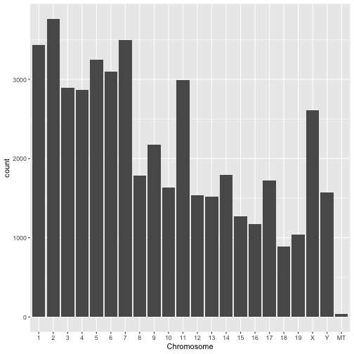
Make a plot showing the numbers of genes in each chromosome. A barplot would be suitable but you may use another plot type if you like.
Question 2.3
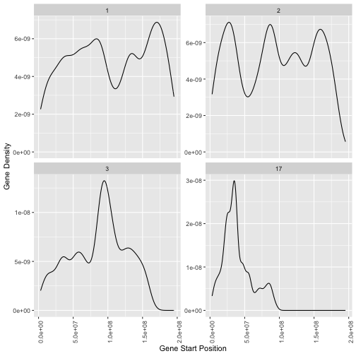
Make a plot showing the density of genes on chromosomes 1, 2, 3 and 17 as a function of genomic coordinate (ie gene start position).
Hint: Use geom_density or geom_histogram from the ggplot2 package with aesthetic x=start
Hint: Use facet_wrap from the ggplot2 package to show each chromosome on a separate plot
Question 2.4
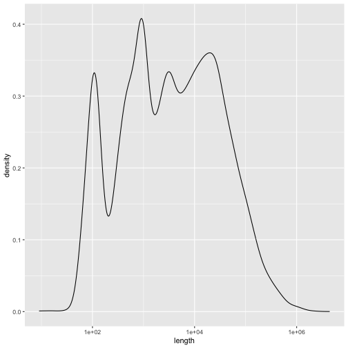
Plot the distribution (frequency histogram or density plot) of mouse gene lengths. Use a log scale for the x axis.
Reflect — genes, transcripts and the reference
You now have the two reference files that the rest of the workflow depends on. The FASTA file tells an aligner where in the genome a read comes from. The GTF file tells you which gene that location belongs to.
- In Question 2.1 you counted genes. Now count the transcripts (
feature == "transcript"). The Measuring gene expression lecture explains that alternative splicing allows one gene to produce several different mRNAs. On average, how many transcripts does each mouse gene have?- In step 3 you will build a reference from both of these files. If you only had the FASTA file, what could you still do, and what would be impossible?
Step 3: Align reads to the genome
In order to align reads to the genome we will use the program Bowtie2 but we won’t actually call it directly. Instead we will use a higher level program RSEM to manage running the alignment and counting reads that align to genes for quantification. We will also use a third program called samtools to inspect alignment files resulting from running bowtie2.
All of these programs should already be installed on the rstudio server.
Index reference data
In order to run bowtie we must first create an index. This step organises the genome data into a structure that allows bowtie to perform read alignment quickly.
We will store the reference as well as all outputs from RSEM in a separate directory.
In this case the command we want to run will take a long time so we will run it as a slurm job. A slurm script to do this is already provided for you called slurm_rsem_prepare_reference.sh. Open this file and take a look at it. It contains some SBATCH commands telling slurm how to run the job. The actual indexing command within this script is just;
mkdir -p rsem
rsem-prepare-reference --gtf raw_data/Mus_musculus.GRCm38.82.chr.gtf --bowtie2 raw_data/Mus_musculus.GRCm38.dna.toplevel.fa rsem/mouse_ref
Run this by submitting your job to the queue
sbatch slurm_rsem_prepare_reference.sh
Hopefully this is familiar to you. You have already run one job using slurm as part of the metagenomics exercise. If you have forgotten how that works take a look here. Some further tips on using slurm can be found here
Notice that both slurm scripts for this exercise include this line
#SBATCH --partition=bigmem
The compute nodes on a slurm cluster are divided into groups called partitions, each set up for a different kind of job. A job that doesn’t name a partition goes to the default one. Indexing a whole mammalian genome and aligning reads to it are large jobs that need more memory, so this line sends them to the bigmem partition, which is set aside for larger jobs.
If the command completed correctly it will generate a total of 13 files under the rsem directory. You can check like this;
ls rsem/mouse_ref.* | wc -l
Note that you must wait for the indexing to complete before proceeding to the next step (alignment).
Align reads to the reference
The code below shows how to align reads from a single sample. Make sure you can get this to work by copying and pasting it directly into the terminal. Be sure to look check the command outputs carefully, making sure that it runs correctly before going further.
mkdir rsem/10k_reads
rsem-calculate-expression -p 2 --paired-end  \
  --output-genome-bam --sort-bam-by-coordinate \
  --bowtie2 \
  raw_data/10k_reads/NNN_1_1.fq.gz raw_data/10k_reads/NNN_1_2.fq.gz \
  rsem/mouse_ref rsem/10k_reads/NNN_1
To check whether this worked take a look at the outputs (they should appear in rsem/10k_reads). You should see the following files;
| File | Description |
|---|---|
| NNN_1.genes.results | Read counts per gene |
| NNN_1.isoforms.results | Read counts per isoform |
| NNN_1.genome.sorted.bam | Reads aligned to the Mouse genome |
| NNN_1.stat | Folder with info rsem learned about the reads |
Now we will perform the alignment for all the samples. This might take some time so the commands have been captured into another slurm script called slurm_rsem_calculate_expression.sh. Have a careful look inside this file. Later you will need to create a modified version of this code so the more you can understand about how it works the better.
Now submit the script to the slurm queue
sbatch slurm_rsem_calculate_expression.sh
Remember you can check progress of your script by looking at the corresponding slurm-XX.out file where XX is your job number. Using the tail command you can even watch as output is added to this file as follows;
tail -f slurm-XX.out
Checking rsem outputs
How would you check that your script had finished correctly? Perhaps the simplest check is to look for the existence of all expected output files (ie each sample should produce a set of files like those shown for the example sample, NNN_1 as shown above). Before you proceed make sure you check that your alignment script worked and that it finished analysis on all samples.
Inspecting bam files
For each sample rsem should have generated a bam file containing all the reads aligned to the mouse genome.
Use samtools to inspect one of these bam files to check how well the reads aligned to the genome. For example to obtain some basic stats on the alignments run the following command;
samtools flagstat rsem/10k_reads/NNN_1.genome.sorted.bam
This command produces output like this
38422 + 0 in total (QC-passed reads + QC-failed reads)
18422 + 0 secondary
0 + 0 supplementary
0 + 0 duplicates
37900 + 0 mapped (98.64% : N/A)
20000 + 0 paired in sequencing
10000 + 0 read1
10000 + 0 read2
19478 + 0 properly paired (97.39% : N/A)
19478 + 0 with itself and mate mapped
The top line states that the bam file contains 38422 alignments. This might seem confusing given that we have only 10k paired end reads (20k reads in total). The discrepancy is explained in the second line of output which states that 18422 of the alignments are secondary, that is they represent additional locations in the genome (other than the best alignment) where reads align.
Primary vs Secondary alignments
In our gene expression analysis we count the number of reads that align to a gene and use this as a measure of the abundance of that gene. The presence of secondary alignments makes this more complicated because it means that a read might have originated from more than one location in the genome and our counts might therefore be based on incorrect alignments. This is one of the issues that our quantification software, RSEM has to deal with when estimating the abundance of each transcript.
The image below illustrates a situation that would result in secondary alignments, where a gene exists with multiple (often slightly diverged) copies. In the example the primary alignment represents a closer match between the read and the gene. It will therefore have a higher alignment score than the alternative, secondary alignment. In addition, the mapq score in the primary alignment is high (100) because we can be fairly confident that this is the correct origin for the read. Many other possibilities exist that would result in different degrees of ambiguity. For example the two gene copies might be so similar that the read can align equally well to both. In such a case the alignment scores will be high, but MAPQ scores will be reduced.
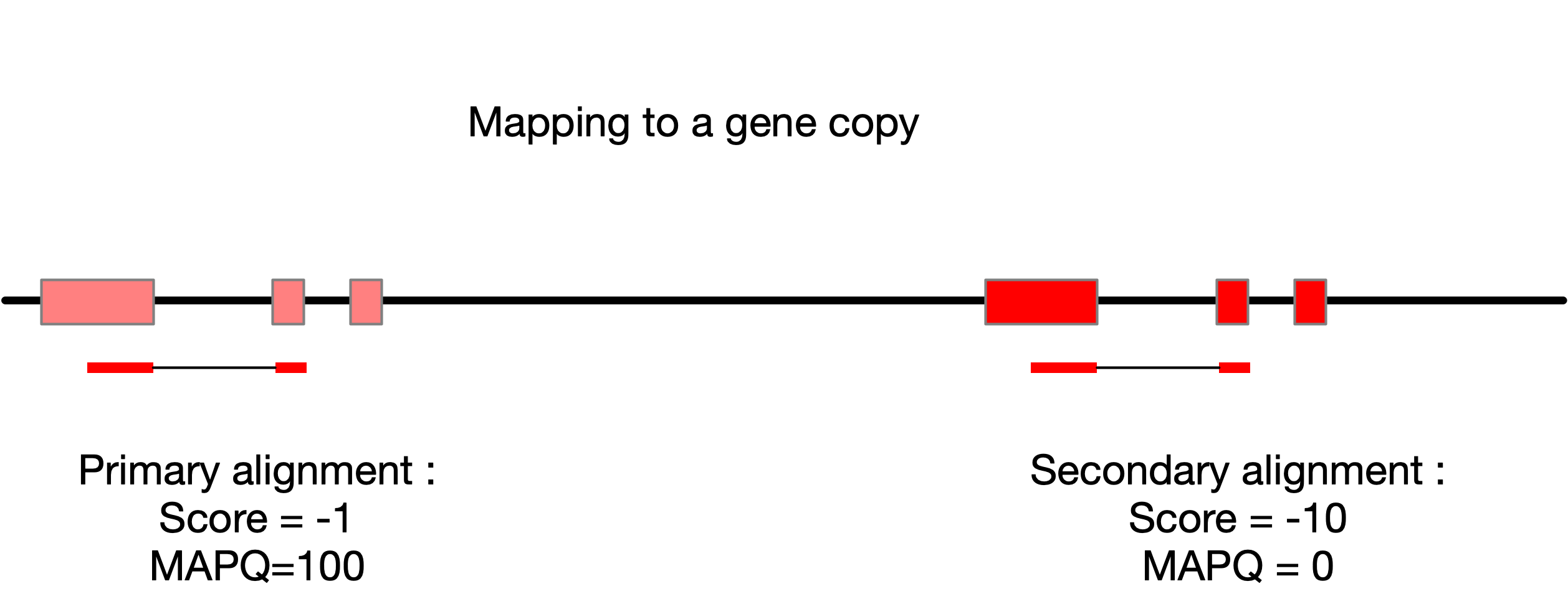
If you want to dig more deeply into how secondary alignments affect mapping quality (MAPQ) scores, there is an optional exercise on this at the end of the guide. It is not needed for any of the later steps.
Reflect — from alignments to counts
This step turns reads into estimates of how much each gene is expressed. It is where the Read alignment and Estimating read counts lectures meet.
- Look at the files in
rsem/andrsem/10k_reads/. You will findmouse_ref.transcripts.fa, and atranscript.bamfor each sample. Were your reads aligned to the genome or to the transcriptome? The Read alignment lecture compares these two options. What kind of discovery does this choice rule out?- The Estimating read counts lecture describes three ways to deal with reads that align to more than one place. Which one does RSEM use? If you discarded multi-mapping reads instead, what would happen to the counts for the two gene copies in the image above?
- Of all the files this step produced, which ones will step 4 use? What role do the
bamfiles play in this workflow?
Step 4: Import RSEM results to DESeq
This section prepares the rsem data for statistical analysis with DESeq2.
Load required packages
The bioconductor packages DESeq2 and tximport are already installed on the rstudio server. Each time you want to use a function from one of these packages you first need to load it (once per R session). Load the packages like this;
library(DESeq2)
library(tximport)
Run tximport
Before we can do any statistical analysis (with DESeq2) we will need to import the rsem data to a DESeq2 object. The authors of DESeq2 have produced a package called tximport which is capable of reading count data from a range of RNAseq analysis pipelines including rsem
The key argument required by tximport in this case is a list of files containing counts. We will use the gene level counts calculated by rsem and can obtain these using the following command.
genes_results_files <- list.files("rsem/10k_reads", pattern = "*.genes.results", full.names = TRUE)
After running the previous command you will have a vector called genes_results_files in your workspace. Print this vector in your R console by typing its name. You should see that it is just a collection of file paths.
Next we will use a regular expression to extract sample names from the file paths in genes_results_files. These names should look like
NNN_1
NN_1
This is accomplished as follows;
basename(genes_results_files) |> str_extract("N+_[0-9]")
We then add these names to genes_results_files to produce a named vector like this
names(genes_results_files) <- basename(genes_results_files) |> str_extract("N+_[0-9]")
The names added above will become column names in our data matrix after import. The actual import can now be done as follows;
txi_genes <- tximport(genes_results_files, type = "rsem", txIn = FALSE, txOut = FALSE)
Explore the txi_genes object created with this command by clicking on its name in the Environment pane in RStudio. It is a list containing several matrices. Each matrix has a row for each gene and a column for each sample.
| matrix | contains |
|---|---|
| abundance | Gene level abundance measured as TPM |
| counts | Raw gene level counts |
| length | Gene lengths estimated from read coverage |
To extract and inspect an individual matrix use the $ operator. For example the first 20 lines of the counts matrix can be inspected with;
txi_genes$counts |> head(20)
This displays counts for the first 20 genes across all the samples. Notice how almost all the counts are 0. If you look closely you will see that a small number of values are non-zero. This is because we ran our analysis based on just 10k reads per sample. Since there are about 46k genes in the genome (more genes than reads) we expect to find less than one read per gene on average. More importantly, our reads will not be evenly distributed across all the genes. Some highly abundant genes (we will find these later) will account for most of the reads, while the majority of genes will have no reads. If a gene has no reads (or very few reads) we can’t determine whether it is differentially expressed between mouse types.
Reflect — what is in the count table
The
countsmatrix has the shape described in the Measuring gene expression lecture: one row per gene and one column per sample. Everything from here on works with this table rather than with reads.
- Make a simple plot of the total number of reads for each gene, summed across all 14 samples (
rowSums(txi_genes$counts)). Use a log scale. Genes with no reads will drop off a log scale, so count those separately. What fraction of genes have no reads at all? How many have at least 10?- The Modelling count variability lecture works through an example of a gene that makes up 1 in 2000 of the mRNA in a sample. How many reads would you expect for that gene with 10,000 reads? With 1M reads?
Create a DESeq2 dataset
All our statistical analysis will be performed using DESeq2. In order to convert our tximport object into a DESeq2 dataset we use the function DESeqDataSetFromTximport.
This function requires that we describe the structure of the data. In other words we need a sample table describing each of the samples in terms of the experimental factors. In this case there is just one experimental factor, the mouse type so we make a data frame with just one column containing the two mouse types, NNN and NN . This is done as follows;
sample_table <- data.frame(mouse_type = str_extract(names(genes_results_files), pattern = "N+"))
Now we can create a DESeq object;
# This line of code is a work around for a problem with our data where some gene lengths appear to be zero.
# This is a technical problem that would rarely appear with real data but occurs because our data is very sparse.
#
# See https://support.bioconductor.org/p/92763/
txi_genes$length[txi_genes$length==0] <- 1


dds_10k <- DESeqDataSetFromTximport(txi_genes,sample_table, ~mouse_type)
Reflect — describing the experiment to DESeq2
The sample table and the formula
~mouse_typeare how you tellDESeq2about the experimental design. The Statistical Modelling of RNASeq Data lecture says a good model should include all the factors that influence gene expression, but no more.
- You have 7 biological replicates of each strain of inbred mice. According to the RNASeq sampling design lecture, why are biological replicates more useful than technical replicates? Why might inbred mice need fewer replicates than human patients?
- Suppose all the
NNsamples had been sequenced before Christmas and all theNNNsamples after. Could you correct for this by adding a batch term to the formula? Why not?
We will do much more with this data later so we save its value. Notice how we are saving a temporary data file into the directory cache. The idea behind files in cache is that they can easily be regenerated by running code, but we keep them around just to avoid having to rerun computationally intensive steps.
write_rds(dds_10k,file = "cache/dds_10k.rds")
If at some later point you want to get the dds_10k object back you can read it directly from cache rather than having to rerun tximport and DESeq2 like this
# This code will load results from the tximport step.
# If the results are not available it will give an error
#
stopifnot(file.exists("cache/dds_10k.rds"))
dds_10k <- read_rds("cache/dds_10k.rds")
For now let’s just inspect it’s internal table of counts. This is the same as our txi_genes$counts table (see above)
assay(dds_10k) |> head()
| NN_1 | NN_2 | NN_3 | NN_4 | NN_5 | NN_6 | NN_7 | NNN_1 | NNN_2 | NNN_3 | NNN_4 | NNN_5 | NNN_6 | NNN_7 | |
|---|---|---|---|---|---|---|---|---|---|---|---|---|---|---|
| ENSMUSG00000000001 | 0 | 0 | 0 | 0 | 0 | 0 | 0 | 0 | 0 | 0 | 0 | 0 | 0 | 0 |
| ENSMUSG00000000003 | 0 | 0 | 0 | 0 | 0 | 0 | 0 | 0 | 0 | 0 | 0 | 0 | 0 | 0 |
| ENSMUSG00000000028 | 0 | 0 | 0 | 0 | 0 | 0 | 0 | 0 | 0 | 0 | 0 | 0 | 0 | 0 |
| ENSMUSG00000000031 | 0 | 0 | 0 | 0 | 0 | 0 | 0 | 0 | 0 | 0 | 0 | 0 | 0 | 0 |
| ENSMUSG00000000037 | 0 | 0 | 0 | 0 | 0 | 0 | 0 | 0 | 0 | 0 | 0 | 0 | 0 | 0 |
| ENSMUSG00000000049 | 0 | 0 | 0 | 0 | 0 | 0 | 0 | 0 | 0 | 0 | 0 | 0 | 0 | 0 |
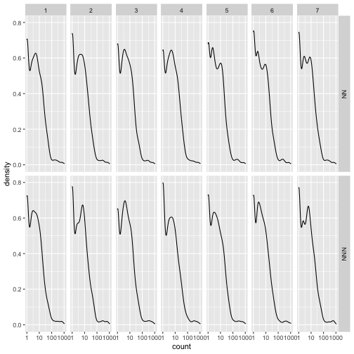
A useful check at this stage is whether the distribution of counts is similar between samples, and most importantly that it does not differ systematically between experimental conditions. The following plot provides a visual check for this purpose.
gg_assay <- assay(dds_10k) |>
  as.data.frame() |>
  rownames_to_column("gene_id") |>
  gather(sample,count,-gene_id) |>
  mutate(mouse_type = str_extract(sample, pattern = "N+")) |>
  mutate(replicate = str_extract(sample, pattern = "[0-9]"))

ggplot(gg_assay ,aes(x=count)) +
  geom_density() +
  facet_grid(mouse_type~replicate) +
  scale_x_log10()
Step 5: Perform differential expression analysis
Recall from step 4 that there were a very large number of zeros in the data. These correspond to genes with very low expression levels. For this exercise we will remove them but for more typical (large real) datasets it is not usually necessary.
dds_10k_nz <- dds_10k[rowSums(counts(dds_10k)>0)==14,]
What is this code doing? Try breaking it down to figure it out. For example what does this do?
dds_10k_gt_zero <- counts(dds_10k)>0
In R (and many other languages) if numerical operations (eg sum) are performed on logical values TRUE is converted to 1 and FALSE to 0. With this in mind what does this code tell us about each row?
dds_10k_nz_row <- rowSums(counts(dds_10k)>0)
So the following code will produce TRUE for genes with no 0 values in any sample and FALSE if any 0 values are present. (Remember that we have 14 samples)
rowSums(counts(dds_10k)>0)==14
Model fitting
The differential expression analysis involves several steps, normalization, model fitting, hypothesis testing. In DESeq the normalization and model fitting steps can be run with a single command;
dds_10k_nz <- DESeq(dds_10k_nz)
Reflect — normalisation
DESeq()normalised your data before fitting the model. The Between sample normalisation lecture shows how boxplots can reveal systematic differences between samples.
- Make boxplots of log counts for each sample, before and after normalisation. You can get normalised counts with
counts(dds_10k_nz, normalized = TRUE). Do the samples line up better after normalisation?- Every sample has almost exactly the same number of reads (check with
colSums(counts(dds_10k))). So why normalise at all? Which of the approaches described in the lecture doesDESeq2use, and what does it assume about most genes?
Explore relationships between samples
Now that we have fitted a model and performed normalization we can ask DESeq to provide normalized, log transformed data that would be suitable for making a principle components analysis (PCA) plot. Actually DESeq does more than just normalize and log transform. It also attempts to remove the relationship that exists between the variance and the mean and this produces values that are particularly useful for visualisation.
To generate a quick PCA plot of the data use the following code
vst_10k <- varianceStabilizingTransformation(dds_10k_nz)
plotPCA(vst_10k, intgroup = "mouse_type")
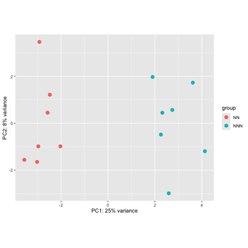
Based on the PCA plot above do you expect to find genes differentially expressed between NN and NNN mouse types?
Reflect — what the PCA plot is for
The Exploratory data analysis lecture lists the goals of exploratory analysis: discover the factors that explain variation in the data, spot outlying or mislabelled samples, and check that the data suit the planned statistical model.
- Use your PCA plot to address each of these goals. What does PC1 separate, and how much of the variance does it explain? Do any samples look out of place?
- The lecture also warns that PCA summarises many genes at once, and that important differences may be due to just a few of them. Keep this in mind when you get to the volcano plot later in this step.
Extract differentially expressed genes
Remember that we already told DESeq about the experimental design and the statistical model we wanted to fit (ie fit a term for the mouse type). DESeq automatically creates names for the coefficients of this model and they can be extracted using the resultsNames function as follows
resultsNames(dds_10k_nz)
## [1] "Intercept" "mouse_type_NNN_vs_NN"
Focus on the second term mouse_type_NNN_vs_NN which captures differences in gene expression between the two mouse types.
Using our fitted model we can now perform a hypothesis test. In this case the test is deciding whether to reject the null hypothesis that the expression of the gene in the two mouse types is the same. This is equivalent to testing whether the value of the fitted coefficient, mouse_type_NNN_vs_NN is equal to zero.
res_10k <- results(dds_10k_nz, name = "mouse_type_NNN_vs_NN")
Inspect res_10k by running the following command in the R console
res_10k |> view()
Take note of the columns. These are;
| Column Name | Explanation |
|---|---|
baseMean |
Mean (log2) read count across all samples |
log2FoldChange |
Size of the difference between NNN NN mice |
lfcSE |
Standard error in the log2 fold change |
stat |
The raw test statistic used to calculate the p value |
pvalue |
Raw p value for the hypothesis test. |
padj |
Multiple testing corrected p value |
The multiple testing correction that is applied to generate padj is done so that it is easy to filter on this value to obtain a gene list with a given false discovery rate (FDR). For example to obtain a list with an expected 5% of false discoveries you only keep genes for which padj <= 0.05
Question 5.1
Write R code to extract a list of significantly differentially expressed genes with a false discovery rate (FDR) of 5%. Note that in order to use tidyverse functions on the res_10k dataset you will first need to convert it to a tibble. You can use the function as.data.frame() to do this as follows;
res_10k |> as.data.frame()
Reflect — multiple testing in practice
You just tested every gene in
dds_10k_nzfor differential expression at once. The Statistical Modelling of RNASeq Data lecture explains why this is a problem: every test carries some chance of a false positive.
- How many genes were tested? If none of them were truly differentially expressed, how many would you expect to have
pvalue < 0.05purely by chance?- How many genes actually have
pvalue < 0.05, and how many havepadj < 0.05? What does this comparison tell you?- The lecture describes two approaches, Bonferroni and Benjamini-Hochberg. Which one produced
padj, and why is it better suited to RNASeq?
Explore the relationship between effect size and statistical significance.
There are two key factors that determine whether a gene will show up as significantly differentially expressed, the size of the effect (ie fold change value) and the amount of variability due to “noise” in the data. One way to explore this is through what is called a “volcanoplot”. A volcanoplot is a scatterplot where each gene shows up as a single point. The x-axis is the log2 fold change (ie log2FoldChange in the DESeq2 results table) and the y-axis is the “log odds” (related to statistical significance), calculated as \(y = -log10(\text{pvalue})\)
signif_genes <- res_10k |>
  as.data.frame() |>
  na.omit() |>
  rownames_to_column("gene_id") |>
  arrange(padj) |>
  filter(padj<0.05)

volc_data <- res_10k |>
  as.data.frame() |>
  na.omit() |>
  rownames_to_column("gene_id")

ggplot(volc_data,aes(x = log2FoldChange, y = -log10(pvalue))) +
  geom_point() +
  geom_point(data = signif_genes, color="red")
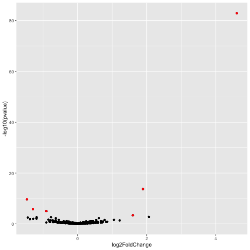
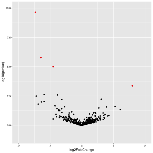
Note that this plot is dominated by one gene with extremely large effect size (log2FoldChange) and statistical significance. This gene might be worthy of further investigation, however, its presence is obscuring data on other genes. To view all of the other genes on a more sensible scale we adjust the x and y limits of the plot as follows.
ggplot(volc_data,aes(x = log2FoldChange, y = -log10(pvalue))) +
  geom_point() +
  xlim(-2,2) + ylim(-1,10) +
  geom_point(data = signif_genes, color="red")
Step 6: Re-analyse with deeper sequencing
The data for this exercise is available at several different read depths. So far you have only analysed the shallowest dataset, which has 10,000 reads per sample. In this step you will redo the analysis using the deepest dataset, which has 1M reads per sample. The additional read depth increases the power to detect differentially expressed genes, and you will need it in step 7 to find the congenic segment.
This is a moderately large dataset and the computations you perform will take some time. It is therefore very important that you run the computationally intensive read alignment step as a slurm job.
Download the 1M reads data
First create a directory for storing the 1M reads data. Keeping it separate from the 10k reads data means the two analyses cannot get mixed up.
mkdir -p raw_data/1M_reads
Now adapt the code you wrote in step 1 to download the 10k_reads data so that this time it downloads the 1M_reads data and stores it in raw_data/1M_reads. These files are 100 times larger than the ones you downloaded before, so check your code with mock_download.file first and only switch to download.file when you are sure it is doing the right thing.
Align reads and quantify expression
Make a copy of slurm_rsem_calculate_expression.sh and call it slurm_rsem_calculate_expression_1M.sh. Edit your copy so that it runs rsem on the 1M reads data. Before you change anything, read through the script and work out which lines control where the reads come from and where the outputs go. Make sure the outputs from the 1M analysis do not overwrite those from the 10k analysis.
Aligning all 14 samples at 1M reads takes a few hours, so the 60 minute time limit in your original script is not enough. Slurm stops any job that runs past its time limit, even if it hasn’t finished. Increase the limit (eg to 600 minutes) by editing the #SBATCH --time line.
When you are happy with your script, submit it to slurm
sbatch slurm_rsem_calculate_expression_1M.sh
Your job keeps running after you log out, so you don’t need to keep RStudio open while you wait. When it has finished, check that it worked for all 14 samples before going further, in the same way that you checked the 10k outputs in step 3.
Import and analyse the 1M reads data
Now go back over the code you ran in steps 4 and 5 and adapt it so that it works for the 1M dataset. At the end of this process you should have a DESeq2 object called dds_1M with zero count genes removed (as in step 5) and with DESeq() already run on it. Save it to the cache directory so that you can reload it in step 7 without rerunning everything.
write_rds(dds_1M, file = "cache/dds_1M.rds")
Compare the number of differentially expressed genes (DEGs) you obtain with 1M reads to the number you obtained with 10k reads. To count the DEGs at a false discovery rate of 5% you can use code like this
dds_1M |>
  results() |> # Extract a table of all genes from the DESeq object
  as.data.frame() |> # Convert this to a data.frame
  filter(padj < 0.05) |> # Retain genes at a false discovery rate of 5%
  nrow() # Count the number of rows (ie number of genes)
Reflect — what more reads bought you
The only thing that changed between your 10k and 1M analyses was sequencing depth. Same mice, same replicates, same model.
- How many genes were tested, and how many DEGs did you find (FDR 5%), at each depth?
- Use the Modelling count variability lecture to explain why more reads give more power to detect a difference. Think about the expected count for a gene and the spread of the Poisson distribution around it.
- The How many reads do we need? lecture explains that more reads are needed to quantify low abundance transcripts. Your 1M analysis tested many more genes than the 10k analysis. Where did the extra genes come from?
Step 7: Find the genomic location of the congenic segment
In step 6 you found many more differentially expressed genes using the 1M reads data. In this final step you will map the genomic locations of those genes and use them to work out where the congenic segment is. That will give you a short list of candidate genes for control of NKT cell production.
The two mouse strains
The design of this particular study was intended to identify genes involved in controlling NKT cell production by contrasting expression in two specially generated strains of mice. The two strains are;
NOD.Nkrp1(coded asNN). These are NOD mice which are deficient in the production of certain immune cells including NKT cells.NOD.Nkrp1.Nkt1(coded asNNN). These mice are the same asNOD.Nkrp1except that a specific region of their genome has been replaced with a segment from C57BL/6 mice, which are not immuno-deficient and have normal production of NKT cells. This region was designed carefully so that it “rescues” production of NKT cells compared with theNOD.Nkrp1strain. We call this region the congenic segment.
The hypothesis here is that genes within the congenic segment are responsible for control of the production of NKT cells. We expect that genes within the congenic segment will be more likely to be differentially expressed than genes from other regions of the genome. We also might expect that genes within the congenic segment that differ strongly in expression between the two strains are good candidates for NKT control genes.
Load the mouse gene models
To find the location of each differentially expressed gene you need the mouse gene models. You already loaded these in step 2. The file R/load_data.R contains a function that does this for you (in case you were unsuccessful in solving the exercises in step 2). Use it to load the mouse gene models again as follows;
source("R/load_data.R")
mouse_genes <- load_gene_models()
Extract gene identifiers
In order to visualise the genome coordinates of differentially expressed genes you need to match their gene identifiers with those of the gene models. The gene identifiers look like this
ENSMUSG00000102693
Take a look at the first few rows of the mouse_genes data. You should see that these gene identifiers are buried within the attribute string. The attribute string is long and contains many pieces of information concatenated together. The code below extracts the gene identifier, as well as the more human-friendly gene name, and places each into its own column.
mouse_genes <- mouse_genes |>
  filter(feature == "gene") |>
  mutate(gene_id = str_extract(attribute, "ENSMUSG[0-9]+")) |>
  mutate(gene_name = str_match(attribute, "gene_name \"([^\"]+)\"")[, 2])
Match differentially expressed genes with their gene models
Load the dds_1M object you saved at the end of step 6. If your own 1M analysis did not work, this code will download a pre-computed version instead.
if (!file.exists("cache/dds_1M.rds")) {
  download.file("https://s3-ap-southeast-2.amazonaws.com/bc3203/nkt_dds/dds_1M.rds", destfile = "cache/dds_1M.rds")
}
dds_1M <- read_rds("cache/dds_1M.rds")
The following code extracts the differential expression results as a data frame and joins them with the gene models. Note that the column gene_id is what allows rows from the two datasets to be matched.
deg_with_models <- dds_1M |>
  results() |>
  as.data.frame() |>
  rownames_to_column("gene_id") |>
  inner_join(mouse_genes, by = "gene_id")
The result should look like this
| gene_id | gene_name | seqname | start | end | log2FoldChange | pvalue | padj |
|---|---|---|---|---|---|---|---|
| ENSMUSG00000000127 | Fer | 17 | 63896018 | 64139494 | -0.1370556 | 0.3850540 | 0.9991325 |
| ENSMUSG00000000346 | Dazap2 | 15 | 100615628 | 100620731 | 0.0328992 | 0.7979101 | 0.9991325 |
| ENSMUSG00000000441 | Raf1 | 6 | 115618067 | 115676635 | 0.1685545 | 0.0100080 | 0.2356886 |
Where is the congenic segment?
Your task is to use deg_with_models to work out the most likely genomic location of the congenic segment, and to show it with a figure. It is very important that you have a good understanding of the concept of “genomic location” and genomic coordinates. The location of a gene is given by both its chromosome (seqname) and its position on that chromosome (start and end).
Work towards one good figure with a caption that would convince a sceptical colleague. Things worth trying are;
- Plot differentially expressed genes against their genomic coordinates. Do they tend to cluster in a particular region of the genome?
- How likely is it that genes would cluster this way by chance? Remember from step 2 that genes are not evenly distributed along chromosomes. A gene dense region will contain more differentially expressed genes just by chance.
- Use the effect size (
log2FoldChange) and statistical significance (padjorpvalue) of each gene, not just whether it passes a significance threshold. Can you show these on the same plot as genomic location? - Iterate on the plot. There are many ways to display this and no single right answer. Aim for a figure where the location of the congenic segment is visible without the reader having to hunt for it.
- Once you know where the congenic segment is, which genes inside it have the largest and most significant changes in expression? These are your candidates for control of NKT cell production.
See the lecture on Principles of scientific graphics for advice on producing high quality figures and captions.
Reflect — from a genomic region to candidate genes
You started this guide with raw reads and have finished with a region of the genome and a short list of candidate genes.
- Look back over the workflow. Which earlier decisions had the biggest effect on your candidate list? Consider sequencing depth, removing genes with zero counts, and the FDR threshold.
- Why should genes inside the congenic segment be differentially expressed at all, even those that have nothing to do with NKT cells? What does this mean for how you interpret your candidate list?
- Your evidence comes entirely from mRNA. The High throughput protein expression lecture shows that mRNA abundance is not always a good predictor of protein abundance. What would you want to measure next to confirm a candidate?
Answers to questions
Question 2.1
gtf_d |> filter(feature == "gene") |> n_row()
## Error in `n_row()`:
## ! could not find function "n_row"
Question 2.2
chrom_order <- c(1:19,"X","Y","MT")
gtf_d$seqname <- factor(gtf_d$seqname,levels = chrom_order)
ggplot(gtf_d |> filter(feature=="gene"),aes(x=seqname)) + geom_bar() + xlab("Chromosome")
Question 2.3
ggplot(gtf_d |> filter(feature=="gene") |> filter(seqname %in% c("1","2","3","17")),aes(x=start)) +
  geom_density() +
  facet_wrap(~seqname, scales = "free_y") +
  theme(axis.text.x = element_text(angle=90)) +
  xlab("Gene Start Position") +
  ylab("Gene Density")
Question 2.4
gtf_d  |>
  filter(feature == "gene") |>
  mutate(length = end-start) |>
ggplot(aes(x=length)) + geom_density() + scale_x_log10()
Question 5.1
signif_genes <- res_10k |>
  na.omit() |>
  as.data.frame() |>
  rownames_to_column("gene_id") |>
  arrange(padj) |>
  filter(padj<0.05)
Optional: Understanding MAPQ scores
This optional section builds on the discussion of primary and secondary alignments in step 3. It uses the bam file for one of the 10k reads samples, so you can do it any time after completing step 3.
In order to understand how MAPQ, Alignment Scores and primary/secondary alignments are related we will extract information from the alignment file (bam format) and import it to R for futher analysis.
Exporting read alignments to tsv for analysis in R
The samtools utility can be used to filter a bam file to show only primary or only secondary alignments, or to show only forward or reverse reads. This is done using sam flags. The sam flag value 256 indicates that an alignment is not the primary alignment. The command below uses the option -f 256 to extract only reads where this flag is set (ie reads that are secondary alignments).
# This extracts the first 10 secondary alignments
samtools view -f 256 rsem/10k_reads/NN_1.genome.bam | head
By changing the option from -f to -F we extract reads that do not match the flag. So the following command would extract the the primary alignments
# This extracts the first 10 primary alignments
samtools view -F 256 rsem/10k_reads/NN_1.genome.bam | head
By combining -f and -F with more sophisticated use of the flag values it is possible to extract reads with other properties (eg forward or reverse).
- The
samformat is a tab separated values table. See this wikipedia article for a specification of the columns. - One of the columns in
samoutput is the mapping quality. In thesamformat specification it states that this value, MAPQ should be related to the probability that the mapped position is wrong (much like PHRED score, but for alignments). Beware that in reality, programs like Bowtie2 and RSEM don’t calculate this exactly, but use heuristics to provide an approximate value. - Think about what would happen if a read mapped equally well to two locations in the genome. How would this affect the MAPQ value?
Remember that we used paired end reads to generate our alignments. Whether a read is forward or reverse is encoded in the sam flag along with the status as primary or secondary alignment. The following bash commands can be used to extract three important columns from the alignments and split the data up into primary, secondary, forward and reverse reads.
samtools view -f 323 rsem/10k_reads/NN_1.genome.bam | awk '{OFS="\t";print $1,$2,$5,$12}' | sed 's/AS:i://' > 10k_secondary_1.tsv
samtools view -f 387 rsem/10k_reads/NN_1.genome.bam | awk '{OFS="\t";print $1,$2,$5,$12}' | sed 's/AS:i://' > 10k_secondary_2.tsv
samtools view -F 256 -f 67 rsem/10k_reads/NN_1.genome.bam | awk '{OFS="\t";print $1,$2,$5,$12}' | sed 's/AS:i://' > 10k_primary_1.tsv
samtools view -F 256 -f 131 rsem/10k_reads/NN_1.genome.bam | awk '{OFS="\t";print $1,$2,$5,$12}' | sed 's/AS:i://' > 10k_primary_2.tsv
After running these commands you should have four tsv files, each with the following columns;
- QNAME (A unique code given to each read)
- FLAG (Magic number encoding lots of information about the alignment)
- MAPQ (Mapping Quality. This depends on alignment scores of all locations where the read maps)
- AS (Alignment score. A value of 0 denotes a perfect alignment and negative values denote alignments with mismatches between read and reference.)
Don’t worry if you don’t completely understand the commands above. If you are curious you can use this tool to understand the flag values.
Next, use the following R code to import these tsv files and merge them into a single dataset. Notice that this captures the code to read each tsv file into a function. We can do this because all four files have the same format. The function also extracts information encoded in the filename to add columns for type (the alignment type) and direction (forward/reverse) into the data. Finally, since everything is captured into a function we can use map_dfr to automatically read and concatenate data from all the files in one command.
read_alignment_summary <- function(path){
  path_parts <- basename(path) |> str_match("10k_([^_]*)_([12])")
  align_type <- path_parts[2]
  read_dir <- ifelse(path_parts[3]==1,"F","R")

  read_tsv(path,col_names = c("QNAME","FLAG", "MAPQ","AS"),show_col_types = F) |>
    add_column(type=align_type) |>
    add_column(direction=read_dir)
}


alignment_summary <- list.files(pattern = "10k.*.tsv") |>
  map_dfr(read_alignment_summary)
Now we use this data to create a plot exploring the relationship between alignment score (how well the read matches the reference), alignment multiplicity (how many times the read aligns to the ref) and MAPQ (a score that incorporates multiplicity and alignment score). This is complex code with many steps. You don’t need to fully understand this code but it is shown here as an example of how you might format a really complex bit of data manipulation and plotting.
Note that the code chains many commands in a long pipe. In your own code you should build such chains in steps, testing and debugging the output at each step because it can be hard to debug a long chain of pipes like this one.
Also note that each step in the pipe is on a separate line. This allows the reader to read down, knowing that each line will represent a step in the data flow. Each step is also commented (text after #). Comments can be useful to help others understand what you did and why you did it. I’m adding quite detailed comments here because this is a tutorial but in your own code you should only add comments to explain things that are not obvious from the code itself. In production code, too many comments can be just as big a problem as having no comments at all. Figuring out exactly when to comment code is tricky and something you will learn through experience.
alignment_summary |>
  filter(direction=="F") |> # Include only forward reads
  group_by(QNAME) |> # Allow us to count alignments on a per-read basis
  mutate(multiplicity=n()) |> # Creates a new column with the count of alignments for each read
  group_by(QNAME,type) |> # Now regroup the data so that we have separate groups for primary / secondary alignments
  summarise(max_mapq=max(MAPQ), max_score=max(AS), # Now summarise each group recording it max MAPQ and max Alignment score (AS)
            multiplicity=dplyr::first(multiplicity),
            multiplicityc=ifelse(multiplicity<3,as.character(multiplicity),">2")) |>
  ungroup() |> # Remove the grouping so that we can reset to group only per-read
  group_by(QNAME) |>
  mutate(as_diff = max(max_score)-min(max_score)) |> # Now for each read we can calculate the difference in alignment scores between primary and secondary reads
  mutate(as_diffc = ifelse(as_diff<2,as.character(as_diff),">1")) |> # Finally, adjust the alignment score difference so that it is a categorical variable
  ggplot(aes(y=max_mapq)) +
    geom_violin(aes(x=reorder(as_diffc,as_diff),fill=type), scale="width") +
    facet_grid(type~reorder(multiplicityc,multiplicity), scales = "free") +
    xlab("Delta AS") +
    ylab("MAPQ Score") +
    theme(legend.title = element_blank())
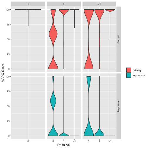
Figure 1: Relationship between alignment score (AS), MAPQ score and alignment multiplicity for primary and secondary alignments. Data is split into panels with rows distinguishing primary and secondary alignments and columns distinguishing alignments with multiplicity of 1, 2 or >2 (multiplicity is the number of times the corresponding read aligns to the genome). Each panel shows the distribution of MAPQ values for alignments as violinplots and within each panel data is split (along the x-axis) by Delta AS which is the difference in alignment score between the primary alignment and best scoring secondary alignment. Note that since alignments with multiplicity=1 will by definition be primary the lower left panel is empty. Data shown are for 10000 reads from an NN mouse mapped to the GRC38 Mus Musculus genome.
The plot shown in Figure 1 is quite complex so take a few minutes to try and understand what it is telling us. First consider alignments that occur with multiplicity of 1 (first column of panels from left). These represent reads that uniquely align to the mouse genome (ie there is just one alignment per read). Notice that all of these reads are marked as primary and that they all have very high (~100) MAPQ scores. This reflects the high confidence that we have correctly identified the location in the genome where these reads originated.
Now move to the next column of panels (alignments with multiplicity 2). In this case we are looking at reads that align to two places in the genome. One of these (the best) will be marked primary and the other one will be marked secondary. Now look at how the distribution of MAPQ scores changes shape depending on the difference in alignment scores between the two alignments. If the difference is 0 (ie primary and secondary alignments both align equally well) the MAPQ scores have nearly identical distributions, and there are lots of low MAPQ scores, reflecting uncertainty about which alignment is the true alignment. As alignment scores start to diverge, however, we see that the MAPQ polarises between primary (high MAPQ) and secondary (low MAPQ).
Overall the key message here is that uncertainty in read alignment doesn’t just depend on its alignment score. It depends on how good that score is compared to the scores of the next-best alignments.