BM3331 / BC5203
Goal
This guide walks you through a complete analysis of 16S metagenomic data using QIIME. It is a formative exercise: nothing in it is graded, and there is nothing to submit.
The goal of this exercise is to provide you with a genuine opportunity to learn how to perform a 16S analysis through experience. You will be performing the same analyses that you learned about in lectures so this is an opportunity to make that theoretical knowledge concrete. If you engage with this exercise you are much more likely to remember the concepts needed for the exam and take home valuable skills for your future work.
To maximise the learning value from this exercise you should pause to reflect as you go through. After each step, ask yourself what did that step actually accomplish, and why was it necessary?. The more you reflect and connect what you did with lectures and with the broader goals of the analysis the more you will learn.
Setup
You should receive a github invitation to your personal copy of the assignment github repository. Create a new project in RStudio by cloning it from github. This is the same procedure used for all the coding assignments and tutorials.
How this exercise connects to your lectures
Everything you do in this guide is an implementation of something covered in the metagenomics lecture series. The lectures explain why each operation is necessary and what the alternatives are; this guide shows you what it looks like when you actually run it. Keep the relevant slides open alongside the guide.
| Week | Lecture | Where it applies in this guide |
|---|---|---|
| 2 | Roger Huerlimann’s guest lecture | Steps 1–2 — 16S sequencing, library preparation and multiplexing |
| 2 | Data Processing Workflow — FASTQ to OTU Tables | The whole guide in overview, plus the three things denoising accomplishes (step 3) |
| 2 | Denoising Algorithms | Step 3 — OTU clustering versus error modelling, OTUs versus ASVs |
| 2 | Chimeras | Step 3 — what deblur removes, and why it matters downstream |
| 2 | Taxonomic Assignment | Step 7 |
| 3 | Statistical Analysis of Microbial Data | Steps 4–5 — the shape of the feature table, alpha versus beta, how metrics are classified |
| 3 | Shannon Diversity | Steps 5–6 |
| 3 | Pielou’s Evenness | Steps 5–6 |
| 3 | Faith’s Phylogenetic Diversity | Steps 4–5 — why step 4 builds a tree at all |
| 3 | Beta Diversity | Steps 4–5 — Jaccard, Bray-Curtis and UniFrac distances |
| 3 | Even Sampling | Steps 5–6 — choosing a rarefaction depth, and what it costs |
| 3 | Interpreting Beta Diversity Data | Step 5 and Extension B |
| 3 | Multi Dimensional Scaling | Step 5 and Extension B |
| 3 | Statistical Hypothesis Testing for metagenomic data | Step 5 and Extension B |
Throughout the guide you will encounter reflection boxes that look like this:
Reflect — the purpose of this step
A question that asks you to articulate what a step is for, or to connect what you just ran to a specific idea from a lecture.
These are the most important parts of the guide. Do not skim them.
Keeping a reflection log
Your repository contains a file called reflections.Rmd. This is where you answer the reflection prompts. It is structured to mirror the seven steps of the guide, with space under each prompt for your answer.
Writing your answers down matters more than it might seem. It is very easy to read a reflection prompt, think “yes, I know that one”, and move on — and then discover two weeks later that you could not actually explain it. Forcing yourself to write a sentence or two exposes the gaps while you still have the data in front of you and can go and look.
Some practical advice:
- Answer the prompts as you go, not at the end.
- Where a prompt asks for a number (how many sequences, what sampling depth you chose), write the actual number down. Looking up these numbers is a good trigger for learning. You will be forced to think about what file that number is in? How to calculate it? and so on.
- It is fine — good, even — to write “I am not sure” and then say what you would need to find out in order to be sure. Identifying the boundary of your understanding is genuinely useful.
- Alongside
reflections.Rmd, keep a record of the commands you ran. A second RMarkdown file (say,moving_pictures.Rmd) with every command pasted into it in order is ideal.
Commit and push both files to github regularly, with meaningful commit messages (“completed deblur step”, “added step 3 reflections”). Nothing here is graded, but if the server has a problem or you delete something by accident, github is your backup. Frequent commits with sensible messages are a habit worth building.
Guide
This guide is a slightly elaborated version of the official qiime moving pictures tutorial available on the qiime website.
How to complete this guide
-
Work through the guide from top to bottom. Each step depends on files produced by the previous one.
-
Run each of the commands. Most of the time this means copying and pasting from the guide into your terminal window.
-
Check that each command actually worked. Look for the output files it was supposed to produce. Read the errors and warnings and satisfy yourself that they are not fatal. A pipeline that fails silently at step 3 will still produce plausible-looking output at step 7.
-
Look at the output before moving on. Almost every step produces something you can inspect — a table of statistics, a visualisation, a count. You will not understand all of it, and that is fine, but you should not move to the next step without having looked.
-
Answer the reflection prompts in
reflections.Rmd.
A few steps deliberately contain broken or incomplete commands. These are not mistakes. Reading an error message and working out what a tool needs from you is a core skill, and it is much easier to practise here than under pressure. Solutions are at the bottom of this guide if you get stuck.
Advice on running commands
Most of the commands in this guide are bash commands. The best way to run them is to cut-paste (or type) them into a terminal window.
If you use an RMarkdown document to take notes you can also create bash code chunks within that document. Please take a look at this short video for my recommendations on how to write these code chunks.
Step 1 : Download and inspect raw data
The starting point for most metagenomics analyses will be a (potentially very large) set of fastq files as well as a tabular file describing each of the samples. The tabular file contains metadata that links the sequencing read data (in fastq files) to the experiment.
Both the sequencing reads and metadata should be considered read-only data. They form the starting point for our analysis and should never be modified. They are also fairly large so they should not be committed to our git repository.
In order to keep things organised we download our starting data to it’s own directory called raw_data. Your git repository is setup to ignore everything inside this folder so it will be safe from being committed to git.
Download the metadata directly to the raw_data folder using the following command;
wget -O "raw_data/sample-metadata.tsv" "https://data.qiime2.org/2024.5/tutorials/moving-pictures/sample_metadata.tsv"
Download reads and corresponding barcodes using the following commands;
mkdir -p raw_data/emp-single-end-sequences

wget -O "raw_data/emp-single-end-sequences/barcodes.fastq.gz" "https://data.qiime2.org/2024.5/tutorials/moving-pictures/emp-single-end-sequences/barcodes.fastq.gz"

wget -O "raw_data/emp-single-end-sequences/sequences.fastq.gz" "https://data.qiime2.org/2024.5/tutorials/moving-pictures/emp-single-end-sequences/sequences.fastq.gz"
Note: We store reads and barcodes in a subfolder of raw_data called emp-single-end-sequences. This is to support QIIME import steps that come later.
What are the barcodes?
Modern sequencers are capable of sequencing a very large number of DNA molecules in a single run. This number of reads is sufficient to support the analysis of many samples simultaneously so it is now very common to run multiple samples on a single run. Barcodes are added to each sample so that reads for each sample can then be separated based on barcode after sequencing. This is an example of multiplexing.
Reflect — why multiplex at all?
Multiplexing is not free. It adds complexity to the sample preparation workflow (in the lab, before sequencing) and it requires an extra data processing step (demultiplexing) after sequencing.
- What do you get in return? (ie what are the benefits of multiplexing, especially for experiments with complex designs or large numbers of samples).
- What determines how many samples you can reasonably put on a single run? Think about what each sample needs in order for the diversity metrics at step 5 to be meaningful.
Securing raw data
Inspect the unix permissions on the data we downloaded
ls -l -R raw_data/
## total 16
## drwx------@ 4 iracooke  staff   128 Jul 13  2021 emp-single-end-sequences
## -rw-------@ 1 iracooke  staff   215 May 11  2018 README.md
## -rw-------@ 1 iracooke  staff  2094 Jul 13  2021 sample-metadata.tsv
##
## raw_data//emp-single-end-sequences:
## total 56816
## -rw-------@ 1 iracooke  staff   3783785 Mar  2  2021 barcodes.fastq.gz
## -rw-------@ 1 iracooke  staff  25303756 Mar  2  2021 sequences.fastq.gz
The files are readable by all users which is fine, but the owner of the files is able to modify them ( w - write ). To make sure the files won’t be modified we can remove this permission as follows;
chmod u-w raw_data/emp-single-end-sequences/*.gz
chmod u-w raw_data/*.tsv
After doing this inspect permissions again to make sure it worked.
Inspecting raw data
The following command demonstrates how to inspect the first few lines of a gzipped fastq file without unzipping the entire file.
gunzip -c raw_data/emp-single-end-sequences/barcodes.fastq.gz | head
This is fastq formatted data which means that each barcode is represented by 4 lines. In order to count the number of barcodes we could count the number of lines and then divide by 4. This is easily done using awkas follows;
gunzip -c raw_data/emp-single-end-sequences/barcodes.fastq.gz | awk 'END {print NR/4}'
awk is a simple language for text processing. It is very powerful and very useful to learn because it is built into every unix-like system. We will only briefly touch on awk in this course. Here is a quick explanation of the command above;
-
The command starts with
ENDas its pattern which tells awk to wait until it reaches the end of the file before running the program (the part between curly brackets{}). -
The awk program uses the keyword
printwhich prints the valueNR/4. -
NRstands for “Number of Records” where each record is a line. SoNR/4would be the total number of lines at the end of the file divided by 4.
Now run the code below to count the number of sequences in the sequences file
gunzip -c raw_data/emp-single-end-sequences/sequences.fastq.gz | awk 'END {print NR/4}'
Counting the number of entries in barcodes and sequences should have revealed that both files have the same number of sequences. This is because every sequence has a barcode.
The barcodes assign sequences to samples as the image below illustrates;
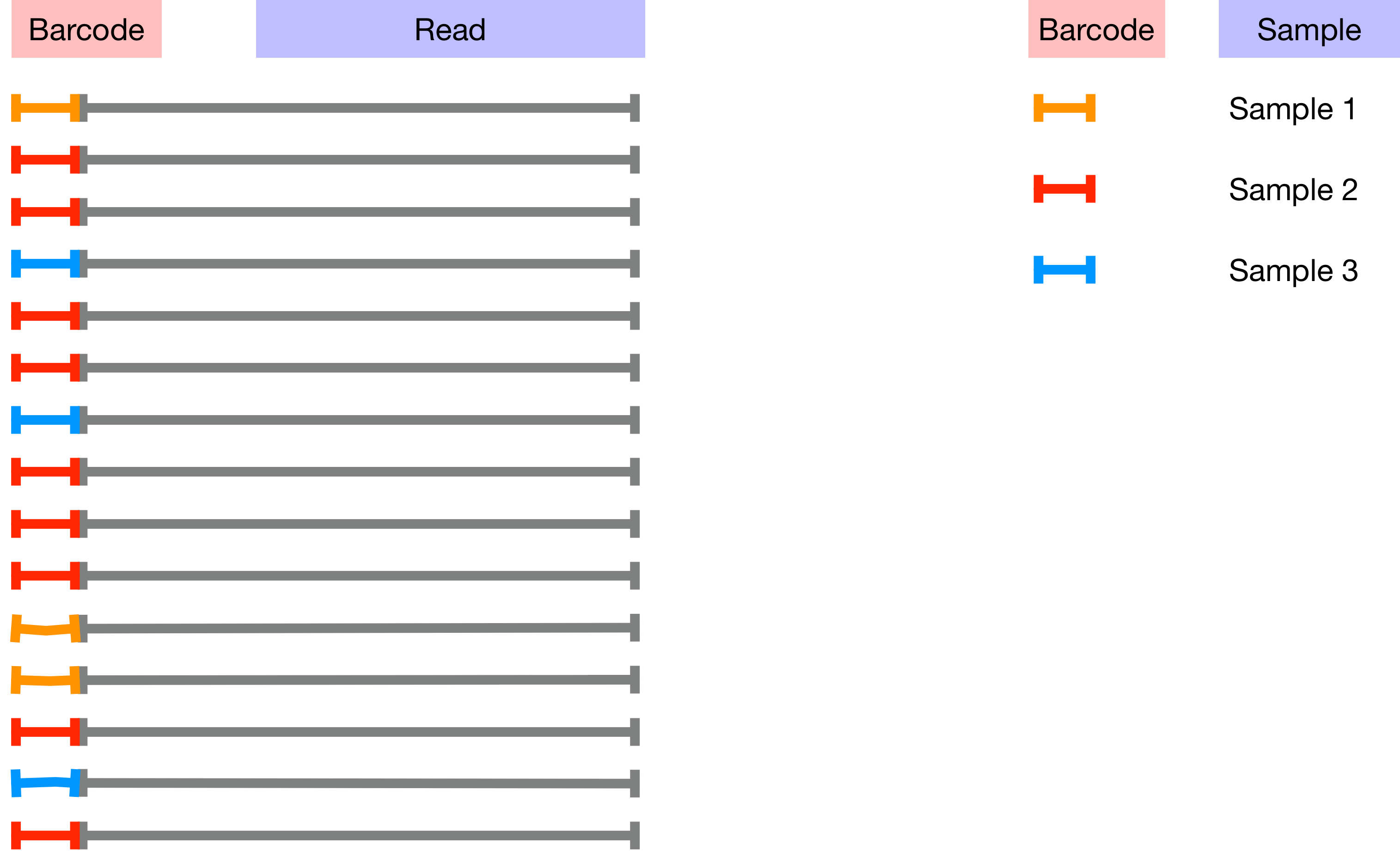
The mapping between samples and barcodes is given in sample-metadata.tsv. Use the code below to inspect sample-metadata.tsv and find the column corresponding to the Barcodes.
head -n 3 raw_data/sample-metadata.tsv
Barcodes are in the second column so you can use the command below to count the number of unique barcodes in sample-metadata.tsv. Note that every sequence in the sequences file is unique but many of the barcodes will occur multiple times. This is because (in theory) all of the sequences for each sample should have the same barcode.
cat raw_data/sample-metadata.tsv | grep -v '^#' | awk '{print $2}' | sort -u | wc -l
Don’t worry if you don’t fully understand how this command works. There are a few important things to note about it. Firstly take note of the pipes |. There are four pipes which separate five commands. Imagine the data starting on the left-most command and passing through the pipes. Each time it passes through a pipe it gets passed as input to the next command as follows;
cat raw_data/sample-metadata.tsvreads the data and sends it to the next commandgrep -v '^#'removes all lines that start with a#symbol- `awk ‘{print $2}’ prints the second column of each line
sort -usorts all lines alphabetically and then removes duplicateswc -lcounts the number of remaining lines.
Based on the number of unique barcodes in the sample-metadata how many unique barcodes would you expect to find in the barcodes.fastq.gz?
Run the code below to determine the actual number of unique barcodes present in the barcodes.fastq.gz.
gunzip -c raw_data/emp-single-end-sequences/barcodes.fastq.gz | awk 'NR % 4 ==2' | sort | uniq | wc -l
There are many more unique barcodes in barcodes.fastq.gz than in sample-metadata.tsv.
Reflect — where do the extra barcodes come from?
A barcode is a short, fixed, known sequence. The Data Processing Workflow — FASTQ to OTU Tables lecture identifies three sources of variation between reads: real differences between taxa, minor allelic differences within a strain, and read errors. Two of those three cannot possibly apply to a barcode.
- Which source is left, and what does that imply about the excess barcodes?
Extension A at the end of this guide asks you to investigate this properly, using R to work out what kind of error is responsible.
Import barcodes and sequences into a QIIME artifact
As a final step for this part of the assignment we will import the sequences and barcodes into a QIIME artifact.
To keep things neat and to avoid accidentally committing large files or temporary analysis files into github we store all qiime results (including artifacts and visualisations) in a separate folder called qiime
qiime tools import \
  --type EMPSingleEndSequences \
  --input-path raw_data/emp-single-end-sequences \
  --output-path   qiime/emp-single-end-sequences.qza
After running this command check to make sure it generated a valid output file at qiime/emp-single-sequences.qza. One way to do this is to inspect the file using the qiime peek function. If everything worked this should report that the artifact type is “EMPSingleEndSequences” and the data format is “EMPSingleEndDirFmt”.
qiime tools peek qiime/emp-single-end-sequences.qza
Step 2 : Demultiplex
Reflect — the purpose of this step
Before you run anything: at this moment you have one enormous pile of reads and no samples. Every question you eventually want to ask — is the gut more diverse than the tongue, does antibiotic use change the community — is a question about samples.
Demultiplexing is the step that turns the pile into samples. Nothing downstream is possible without it.
Having downloaded our data and given it a brief check we will now perform demultiplexing on it. This process uses the barcode-to-sample assignments present in the sample-metadata file to separate the reads according to sample.
Run the code below to perform the demultiplexing using the emp-single demultiplexing engine in qiime. This process takes a while (around 1 minute) so be patient when waiting for it to run.
qiime demux emp-single \
  --i-seqs qiime/emp-single-end-sequences.qza \
  --m-barcodes-file raw_data/sample-metadata.tsv \
  --m-barcodes-column barcode-sequence \
  --o-per-sample-sequences qiime/demux.qza \
  --o-error-correction-details qiime/demux-details.qza
Summarise demultiplexed sequences
Up to now you will have seen that we used qiime to create so called artifacts. These artifacts are useful as steps in an analysis pipeline but they are not particularly useful without a tool to inspect and summarise them. Fortunately qiime provides such a tool, called summarize. The next bit of code uses summarize to create a visualization object.
qiime demux summarize \
  --i-data qiime/demux.qza \
  --o-visualization qiime/demux.qzv
Now examine the visualisation file you created above (ie demux.qzv) using the qiime viewer. The qiime viewer is a web application that allows you visualise any qiime2 created visualisation file. You will first need to download the file to your local computer
Once you have downloaded the file you should be able to drag and drop it onto the qiime viewer.
Use the interactive viewer to work through the following. Record your answers in reflections.Rmd.
-
How many samples have more than 10000 sequences?
-
At what position in the read does the median quality score first drop below 30?
-
Given that quality scores are Phred scaled what is the probability of error for Q30?
-
What is the total number of demultiplexed sequences? How does this compare with the total number of raw sequences (prior to demultiplexing)? What might account for the difference?
Reflect — quality scores
- Q30 is a probability. Convert it. In a 120 bp read where every base is called at Q30, how many erroneous bases would you expect on average? Now recall that this run produced over a million reads. Roughly how many reads carry at least one error? This number is the reason step 3 exists.
- The quality profile is not flat. You found the position where median quality drops below 30. Deblur will ask you for a trim length. Does your answer suggest a sensible value, and does it match the value the guide uses later?
- Reads went missing. Demultiplexing discards any read whose barcode cannot be assigned to a sample. Given what you found about the barcodes in step 1, is the size of the loss what you would have predicted?
Look ahead. The Even Sampling lecture makes the point that every alpha and beta diversity metric is sensitive to sequencing depth, and that unequal depth between samples has to be dealt with before any of them are valid. You are looking at the per-sample depths right now, in
demux.qzv. Scan them: is the spread narrow or wide? Are there samples sitting well below the rest? Write down anything that looks marginal — at step 5 you will have to decide what to do about exactly these samples.
Step 3 : Denoise
Reflect — the purpose of this step
This is the conceptual centre of the whole workflow. The Data Processing Workflow — FASTQ to OTU Tables lecture explains what happens during denoising:
- It greatly reduces the data size, representing many reads with one sequence.
- It sorts reads into groups representing distinct taxa in the original sample.
- It decides which differences between sequences can be ignored and which are important.
As you work through this step, collect the evidence that each of these of these three tasks have been accomplished.
Microbial communities can be highly diverse which means that any given sample might contain thousands of different true 16S sequences corresponding to different species and/or strains of microbes. If it was possible to obtain error free sequencing data we would expect to obtain a single representative sequence for all microbes belonging to a particular strain because they should be (almost) genetically identical.
In this step we deal with the fact that sequencing is not error free. Even Illumina sequencing generates errors when reading each base. In addition to this, the fact that 16S sequencing is based on amplification of many similar sequences means that we are likely to have chimeric reads which must be flagged and removed.
Both base calling errors and chimeras result in an inflation of the number of unique sequences in our data compared with what was actually in the sample. In this step our aim is to find reads that would have originated from the same real sequence, group them together and represent them using a single “representative sequence”. There are many methods for doing this. We will use Deblur. In lectures we discuss two broad approaches to denoising;
- Error modelling, which is implemented in Deblur and dada2
- OTU Clustering which is implemented in UPARSE
The error modelling approach is now favoured over OTU clustering in almost all circumstances. We chose to use Deblur for this tutorial just because it is easy to run within qiime but the dada2 approach is similar in principle.
Reflect — two strategies for the same problem
The Denoising Algorithms lecture presents OTU clustering and error modelling as answers to the same question, arrived at differently.
- OTU clustering ranks sequences by abundance and groups anything within 3% similarity. Error modelling ranks by a p-value derived from a learned error model, and splits clusters until the differences within each one are plausibly explained by sequencing error alone.
- The 3% threshold is a fixed number, chosen in advance and applied to every dataset. The error model is learned from your reads. What is the practical consequence of that difference — particularly for a dataset where two genuinely distinct strains differ by less than 3%?
- OTU clustering yields OTUs; error modelling yields ASVs. Why does the distinction matter biologically?
Filter sequences by base call quality
Although Deblur takes quality scores into account it is best to trim sequences first to remove the very worst data. The code below uses the qiime quality-filter tool to do this. It’s default is to trim sequences to avoid any base calls with quality scores less than 4 on a Phred scale.
qiime quality-filter q-score \
 --i-demux qiime/demux.qza \
 --o-filtered-sequences qiime/demux-filtered.qza \
 --o-filter-stats qiime/demux-filter-stats.qza
Now use another qiime command to produce a visualisation of the filtering statistics
qiime metadata tabulate \
  --m-input-file qiime/demux-filter-stats.qza \
  --o-visualization qiime/demux-filter-stats.qzv
Download the visualisation file demux-filter-stats.qzv to your computer and visualize it using the qiime2 viewer.
The visualisation is just a table showing some statistics on how many reads were removed as a result of filtering. Each row in the table shows stats for a sample.
Use the button Download metadata TSV file to download the table and then upload it back to your RStudio instance. Rename the file to demux-filter-stats.tsv and save it in the qiime folder.
Now run the bash command below. This will print the sample name and the proportion of retained reads (to input reads) for each sample.
cat qiime/demux-filter-stats.tsv | tail -n +3 | awk '{print $1, $3/$2}'
Now run this bash command to print the average proportion of retained reads across all samples.
cat qiime/demux-filter-stats.tsv | tail -n +3 | awk 'BEGIN{av=0}{av+= $3/$2}END{print av/NR}'
A particularly low proportion of retained reads compared with the average could indicate a problematic sample. Note that this is just one of many ways that you could identify potentially problematic samples. You should usually try to avoid throwing away samples, but if a sample gives results far outside other replicates (ie an outlier) then these quality metrics can be used to decide where the problem arose (ie in sequencing, or in sample prep) and whether to discard the sample.
Denoise sequences
Now run deblur to reduce sequences down to a set of unique sequences representing the different organisms present in the sample. This step will also trim bases from the quality filtered reads as well as remove chimaeras.
How to deal with long running commands
This command takes a long time to run (about 10 minutes). Long running commands like this pose special problems. In particular we would like to;
-
Allow the command to run in the background so that we can keep working
-
Allow the command to keep running even if we logout of the server
-
Avoid crashing the server by putting it under too much load
Unfortunately if you simply run a long running command using the run button on an RMarkdown document (like this) you won’t achieve any of the goals listed above.
There are lots of ways to deal with long-running commands. Here we will use a queuing system called slurm. Systems like slurm are normally used in large clusters or supercomputers and can prioritise large numbers of jobs across many compute nodes. The JCU High Performance Computer system (JCU HPC) uses a similar system called PBS. Here I have installed slurm on our single node to allow the whole class to run longer jobs without crashing the server.
To run a command as a slurm job requires a little extra effort. Instead of simply typing the command in the Terminal and hitting enter we need to wrap our command into a short “job script”. In this case I’ve already done this for you so you can see what a job script looks like. Open the file called 03_deblur_slurm.sh by clicking on it in the file browser. It should show code that looks like this;
#!/bin/sh
#SBATCH --time=60
#SBATCH --ntasks=1 --mem=1gb

echo "Starting deblur in $(pwd) at $(date)"

alias qiime='apptainer run -B /pvol/:/pvol /pvol/data/sif/qiime.sif qiime'

qiime deblur denoise-16S \
  --i-demultiplexed-seqs qiime/demux-filtered.qza \
  --p-trim-length 120 \
  --o-representative-sequences qiime/rep-seqs-deblur.qza \
  --o-table qiime/table-deblur.qza \
  --p-sample-stats \
  --o-stats qiime/deblur-stats.qza

echo "Finished deblur in $(pwd) at $(date)"
The three lines at the top that start with # are special. Let’s walk through them
#!/bin/bash
This tells slurm that we want to run our commands in the bash shell. This is the command line interpreter we are using for all our command line exercises.
#SBATCH --time=60
#SBATCH --ntasks=1 --mem=1gb
These lines are special instructions to slurm to tell it what physical resources our job will need. We are telling it that the job should not take more than 60 minutes --time=60, that it will use just one CPU --ntasks=1 and no more than 1Gb of memory --mem=1gb. These are quite important because slurm will use this information to figure out how many jobs it can safely run at the same time. Our goal when writing a slurm script should be to ask for just enough resources and no more. The numbers provided here should work well for this task.
echo "Starting deblur in $(pwd) at $(date)"
Next we have an echo command which will let us see when the job started. When the job starts running it will produce an output file. We can look that that file and should expect to see this information in there.
alias qiime='apptainer run -B /pvol/:/pvol /pvol/data/sif/qiime.sif qiime'
When we type qiime on the command line it actually acts as shorthand (also called an alias) for a longer and more complex command. You can see this by running the following command
type qiime
Because our slurm command is running in a new shell it wont have this alias setup so we need to explicitly define it again in our slurm script.
qiime deblur denoise-16S \
  --i-demultiplexed-seqs qiime/demux-filtered.qza \
  --p-trim-length 120 \
  --o-representative-sequences qiime/rep-seqs-deblur.qza \
  --o-table qiime/table-deblur.qza \
  --p-sample-stats \
  --o-stats qiime/deblur-stats.qza
Finally we have some lines which are just a normal qiime command.
OK so now we are ready to run the command. We do this as follows;
sbatch 03_deblur_slurm.sh
If everything is working you should see output like this
Submitted batch job <number>
Now your job should actually be running behind the scenes. There are several things you can do to check on it. Firstly try the squeue command. This will show all the queued and running jobs within the system. It might look something like this

Important parts of this to pay attention to are
- the
USERcolumn. You should look for your login id to find your job - the
STcolumn. This tells you the status of your job.Rmeans it is running. - the
TIMEcolumn tells you how long your job has been running for. - the
JOBIDcolumn gives a number identifying the job
If there are a lot of jobs in the queue it might be tricky to find yours. You can restrict the list to show only your job by using the -u option like this (where jcXXX is your login ID)
squeue -u jcXXX
If you realise that you made a mistake you can cancel a job with scancel. First find the JOBID number and then enter it like this
scancel JOBID
Once your job starts running it will produce output. Look for a file called slurm-JOBID.out where JOBID is a number. Take a look in this file to see output from your job at any time
cat slurm-JOBID.out
The command should take around 5-10 minutes to run. When it is finished it will disappear from the list in squeue. You can also check the output file and you will know that the job is finished because you will see output something similar to this;
Starting deblur in /home/test2023/metagenomics-iracooke-1 at Thu 03 Aug 2023 09:07:38 UTC
Saved FeatureTable[Frequency] to: qiime/table-deblur.qza
Saved FeatureData[Sequence] to: qiime/rep-seqs-deblur.qza
Saved DeblurStats to: qiime/deblur-stats.qza
Finished deblur in /home/test2023/metagenomics-iracooke-1 at Thu 03 Aug 2023 09:12:54 UTC
Inspect denoised outputs
Three output files are produced by the denoising step. We inspect each of them using qiime’s visualisation tools and the command-line
Representative sequences: Are sequences that represent a collection of very similar reads in the raw data. In theory each representative sequence should represent a different taxonomically distinct organism in the sample. These are contained in an artifact called rep-seqs-deblur.qza
Create a visualisation for the representative sequences identified by deblur
qiime feature-table tabulate-seqs \
  --i-data qiime/rep-seqs-deblur.qza \
  --o-visualization qiime/rep-seqs.qzv
Open the rep-seqs.qzv in the qiime viewer. This viewer will show you a list of sequences each of which is 120 bases long. A few things are worth noting;
- How many representative sequences are there in total? Why is this much less than the total number of reads/sequences in the experiment?
- Each sequence represents a fragment of the 16S gene from a particular organism. One way you could identify the organism itself is by performing a BLAST search of the sequence against a large database of known sequences. This is very easy in the
qiimeviewer. Just click the sequence itself and it will take you to a BLAST results page. Try this for a few sequences and take a look at the names of organisms that come up. Later on in this tutorial we will perform taxonomic classification of these same sequences using a machine learning classifier, which is a faster, more accurate approach.
Feature table: This artifact (called table-deblur.qza) contains counts of the number of occurrences of each representative sequence in each sample.
Create a visualisation for the feature table using the code below.
qiime feature-table summarize \
  --i-table qiime/table-deblur.qza \
  --o-visualization qiime/table-deblur.qzv
Inspect the visualisation using the qiime viewer. You should see that each sample is just labelled according to its code (eg L5S222). Naturally it would be much better if we could visualise the data along with information about the sample (eg which body site, antibiotic treatment etc).
In order to improve the visualisation you will need to remake it. This time you will need to include information from the sample-metadata.tsv file in raw_data/sample-metadata.tsv. To figure out how to do this you should inspect the help for the feature-table summarize tool in qiime (see below). Look for an option that would allow you to incorporate sample metadata.
qiime feature-table summarize --help
Remake the visualisation and then explore it in your web browser to answer. From which body site does the sample with the highest depth come from? (Note that you can find this out in the “Interactive sample detail” view by sliding the “Sampling Depth” indicator to the right until only one sample remains. The body site for this sample is the answer.)
Reflect — what denoising accomplished
Now collect the evidence that denoising has accomplished its three main objectives.
- Data reduction. Write down the number of reads going in and the number of representative sequences coming out. What is the reduction factor?
- Grouping into taxa. Each representative sequence is meant to correspond to one biologically distinct organism. Given that they are only 120 bp of one gene, how confident should you be that this is one-sequence-to-one-organism? Where might it break down in each direction?
- Deciding what matters. Of the three sources of read variation listed in the Data Processing Workflow lecture, deblur is trying to eliminate read error while preserving real differences between taxa. The third — minor allelic differences within a strain — sits awkwardly between the two. Should denoising keep those differences or remove them? Is there a right answer?
On chimeras. Deblur also removed chimeric sequences, quietly, as part of this step. The Chimeras lecture notes these can exceed 50% of sequence variants in 16S data, because a PCR reaction full of near-identical templates is close to ideal conditions for forming them.
- A chimera is a novel sequence that belongs to no organism. Follow it through: if chimeras survived to step 4, what would happen to your tree? To observed features and Faith’s PD at step 5? To the rarefaction curves at step 6?
On the two outputs. This step produced
rep-seqs-deblur.qzaandtable-deblur.qza. Be clear about the difference: one holds sequences, the other holds counts per sample for each sequence. The Statistical Analysis of Microbial Data lecture shows the feature table’s shape explicitly — features as rows, samples as columns, counts in the cells.
- Which of the remaining steps consume the sequences, and which consume the table?
- The table is the basis of all quantification from here on. What information about your samples is not in it, and therefore permanently unavailable to every downstream step?
Step 4 : Construct a phylogenetic tree from representative sequences
Reflect — the purpose of this step
This step produces a phylogenetic tree, but, it isn’t the kind of tree you would put in a paper. It’s too large and complex to be particularly useful for manual inspection. Instead, we will use this tree as an input for other steps in the workflow.
Your feature table treats every ASV as an equally unrelated entity — as far as a count table is concerned, two sequences differing by one base are exactly as different as two sequences from different phyla. But a sample containing ten closely related strains is not as diverse as a sample containing ten organisms from across the bacterial tree, and no metric built on counts alone can tell the difference.
The tree is what lets the next step make that distinction. Keep that in mind as you build it: you are not doing phylogenetics for its own sake here, you are manufacturing an input for step 5.
The previous step used Deblur to reduce the dataset from millions of individual reads down to just a few hundred distinct sequences. Each of these sequences represents a different organism present in the samples. In this step we examine the phylogenetic relationships between them. This allows us to identify sequences that are from closely related organisms versus those from more distant taxa. This will allow phylogeny based diversity metrics to be calculated in subsequent steps.
Align sequences
First create a multiple sequence alignment of all the representative sequences. The goal of multiple sequence alignment is to identify sections of the sequences that are homologous and line these up so that they occupy the same positions in the alignment.
To perform an alignment we use the program mafft. We don’t actually run mafft directly but use the qiime plugin for mafft.
The code below is broken. Try running the code. Look at the error that is produced and then fix the code
qiime alignment mafft \
  --o-alignment qiime/aligned-rep-seqs.qza
Inspect the alignment
qiime doesn’t have a viewer for multiple sequence alignments so export the alignment from qiime archive format to fasta as follows;
mkdir -p qiime/aligned-rep-seqs
qiime tools export --input-path qiime/aligned-rep-seqs.qza --output-path qiime/aligned-rep-seqs
Take a quick look at the exported file to get a feel for how an MSA is represented in fasta format. Note the presence of gaps - indicates that this is an alignment, not raw sequences. The aligner (mafft) inserts gaps into some sequences in order to make homologous positions line up across all sequences.
head -n 6 qiime/aligned-rep-seqs/aligned-dna-sequences.fasta
## >cb2fe0146e2fbcb101050edb996a0ee2
## TACGTAGGTGGCAAGCGTTATCCGGAATTATTGGGCGTAAAGCG------------CGCGTAGGCGGTTTTTTAAGTCTGAT--GTGAAAGCCCACGGCTCAACCGTG-GAG-GGTCATTGGAAACTGGAAAACTT--
## >ad41fe8f8be5b01c96549309937e3b14
## TACGTAGGGGGCTAGCGTTGTCCGGAATCACTGGGCGTAAAGGG------------TTCGCAGGCGGAAATGCAAGTCAGAT--GTAAAAGGCAGTAGCTTAACTACT-G-T-AAGCATTTGAAACTGCATATCTTG-
## >d29fe3c70564fc0f69f2c03e0d1e5561
## TACGTAGGTCCCGAGCGTTGTCCGGATTTATTGGGCGTAAAGCG------------AGCGCAGGCGGTTAGATAAGTCTGAA--GTTAAAGGCTGTGGCTTAACCATA-GT--ACGCTTTGGAAACTGTTTAACTTG-
Manual inspection of multiple sequence alignments is greatly facilitated by a coloured view. There are many programs that do this. The code below shows how to create an interactive MSA viewer in R. You will need to install the R package msaR first.
library(msaR)
msaR("qiime/aligned-rep-seqs/aligned-dna-sequences.fasta")
Scroll all the way to the right to see the whole alignment. It should be around 138 bp in total. Note that this is longer than the original sequences (120 bp) because gaps have been inserted.
Mask regions that are not alignable
This is generally a good alignment because there are many positions where there is little variation between sequences. There are several small regions however where very few sequences contain homologous residues, or where many sequences have a gap. Multiple sequence alignment is a challenging problem and alignment programs are often known to make mistakes. In particular, regions with little conservation (ie bases are highly variable between sequences ) are more difficult to align properly. Since poorly aligned regions are likely to lead to poor phylogenetic inferences we mask these by removing them from the alignment.
qiime alignment mask \
  --i-alignment qiime/aligned-rep-seqs.qza \
  --o-masked-alignment qiime/masked-aligned-rep-seqs.qza
Export the masked alignment created in the previous step and visualise it using msaR. You probably won’t notice much of a difference because only a few positions have been masked. If you scroll all the way to the right you will see that the alignment is only around 131 bp this time so we lost 7bp from the masking.
qiime tools export --input-path qiime/masked-aligned-rep-seqs.qza --output-path qiime/masked-aligned-rep-seqs
library(msaR)
msaR("qiime/masked-aligned-rep-seqs/aligned-dna-sequences.fasta")
Build a phylogenetic tree
Now use the program FastTree to infer a phylogeny from our multiple sequence alignment. As with mafft we don’t actually run FastTree directly but use the corresponding qiime plugin instead.
qiime phylogeny fasttree \
  --i-alignment qiime/masked-aligned-rep-seqs.qza \
  --o-tree qiime/unrooted-tree.qza
This step produces an unrooted tree. In an unrooted tree the tree topology and branch lengths describe relationships between sequences but the direction of evolution is not known. This limits inferences we can make about relatedness between taxa. There are two widely used methods for rooting a tree. The ideal method is to use an outgroup taxon but for microbial metagenomics studies this is rarely practical. Instead we perform a midpoint rooting procedure which works as follows;
- Select the two sequences with the longest overall branch lengths between them
- Place the root of the tree at the midpoint between these sequences.
The implicit assumption here is that all branch lengths represent evolutionary times (ie evolutionary rate is constant).
qiime phylogeny midpoint-root \
  --i-tree qiime/unrooted-tree.qza \
  --o-rooted-tree qiime/rooted-tree.qza
Visualise the tree
First export the rooted tree. You should be starting to get familiar with this process of exporting data by now. This is a common pattern because often the qiime generated qza files contain useful information that can be viewed and analyzed using other programs.
qiime tools export --input-path qiime/rooted-tree.qza --output-path qiime/rooted-tree/
The resulting exported tree file is in Newick format (extension .nwk). Upload this tree file to the interactive tree of life tree viewer. This website offers very user friendly and sophisticated visualisation and manipulation of trees.
Viewing the tree should give you a feel for the diversity of bacterial taxa that exist in the sample but because the nodes in the tree are not assigned any taxonomic labels there is not much else we can say from looking at this tree. If we had a particular interest in one group of bacteria we might want to create a tree focussed on just that group and perhaps annotate the tree with colours or different sized points to indicate abundance. We won’t be doing that here, but keep in mind that this is one avenue of discovery that microbial researchers might explore in greater depth.
Reflect — which metrics actually need this tree?
The Statistical Analysis of Microbial Data lecture divides diversity metrics along two axes: quantitative versus qualitative (does it account for abundance?) and phylogenetic versus non-phylogenetic (does it account for evolutionary relatedness?). The phylogenetic half of that split is the reason this step exists — the Faith’s Phylogenetic Diversity and Beta Diversity lectures cover the metrics that read directly off the tree you are building here.
At step 5 you will calculate observed features, Shannon diversity, Pielou’s evenness, Faith’s PD, Jaccard distance, Bray-Curtis distance and UniFrac. Before you run it, go through that list and mark which ones consume the tree you just built. Then check your answer against what
core-metrics-phylogeneticactually produces.
Step 5 : Perform diversity analyses
Reflect — the purpose of this step
Steps 1 to 4 were bioinformatics: turning raw signal into a clean, structured dataset. This step is where the exercise becomes microbial ecology. Everything so far has been preparation for the questions you are about to ask.
Two things are happening here, and it is worth keeping them separate in your head. First you standardise sampling effort, which is a technical necessity. Then you measure diversity, which is the actual scientific question. The first is not part of the biology at all — it exists purely because sequencing gives you an arbitrary and unequal number of reads per sample.
Choose sampling depth
One of the critical aspects of diversity analyses is ensuring even sampling effort across samples. In practical terms this means that we need to pick a minimum cut-off for the number of sequences per sample. If a sample has more sequences than the cut-off a random subsample will be used. If a sample has fewer sequences than the cut-off it will be excluded from the analysis. If you are confused about this concept refer to the Even Sampling lecture.
Picking this number too low will result in loss of some low abundance sequences whereas picking it too high will result in loss of samples.
Use the qiime viewer to visualize qiime/table-deblur.qzv and use the interactive sample detail view to choose an appropriate value for minimum sampling depth. Don’t get too hung up on the exact value you choose here but as a general rule of thumb you should avoid removing more than a handful of samples.
Reflect — the cost of your choice
Whatever number you pick is wrong in one direction or the other. The Even Sampling lecture explains this: set the depth too low and you lose the less abundant sequences from every sample; set it too high and you lose whole samples, and with them any ASVs unique to those samples. The advice is to go as high as possible while minimising sample loss.
- Write down the number you chose and how many samples it excluded. Are the excluded samples random, or do they share something? If all the low-depth samples come from one body site or one subject, you are not losing data evenly — you are losing a category, and that is a different and more serious problem.
Calculate diversity metrics
Run the code below to calculate diversity metrics. Important: Substitute the minimum sampling depth value you decided on above (the value of 200 shown below is not an ideal choice).
qiime diversity core-metrics-phylogenetic \
  --i-phylogeny qiime/rooted-tree.qza \
  --i-table qiime/table-deblur.qza \
  --p-sampling-depth 200 \
  --m-metadata-file raw_data/sample-metadata.tsv \
  --output-dir qiime/core-metrics-results
Look inside the qiime/core-metrics-results folder that this creates. It contains many files corresponding to different alpha and beta diversity metrics. Note that some .qzv files have already been created for you in here. You can download these and then visualise them with the qiime viewer https://view.qiime2.org/
Reflect — sorting out what you just calculated
That one command produced a lot of files, and they are not all the same kind of thing. Before going further, impose some order on them.
- Build the grid. Draw the two-by-two from the Statistical Analysis of Microbial Data lecture (quantitative/qualitative against phylogenetic/non-phylogenetic) and place each metric in it: observed features, Shannon, Pielou’s evenness, Faith’s PD, Jaccard, Bray-Curtis, unweighted UniFrac. A few are awkward to place — Faith’s PD in particular is phylogenetic but ignores abundance entirely. Those awkward cases are the ones worth thinking hardest about.
- Separate alpha from beta. Alpha diversity gives you one number per sample. Beta diversity gives you a number per pair of samples. Look at the file contents and confirm this for yourself: the alpha outputs are vectors, the beta outputs are distance matrices. They answer different questions — state each question in a sentence.
- Why so many metrics? Recall the two “which is more diverse?” examples from that same lecture: one sample with five species dominated by one, against another with four species evenly spread; or one sample with four closely related taxa against another with three distinct ones. In each case, “which is more diverse?” has no answer until you say what you mean by diverse. So when your metrics disagree with each other, that is not a problem to be resolved — it is the result.
- On the ordination files. The
core-metricsoutput includes PCoA results for each distance metric. The Interpreting Beta Diversity Data and Multi Dimensional Scaling lectures explain why these are necessary: a distance matrix for 33 samples holds over 500 numbers, and no one can read that. Ordination compresses it to a picture — at the cost of not representing the distances exactly. Open one of the_emperor.qzvfiles to see how useful these kinds of ordiation analyses can be.
Perform statistical analyses
Now use the alpha-group-significance plugin in qiime to perform a statistical test for association between Faith’s phylogenetic diversity and sample metadata. The test that will be performed is a Kruskal Wallis test which is the non-parametric equivalent of a one-way ANOVA. You can use this test to determine whether samples grouped according to a factor (eg body-site) come from the same distribution (the null hypothesis). A shorthand way of saying this is that it tests to see whether a grouping factor “is significant” in the sense that groups have different values of a response variable (eg alpha diversity). Run the code below and view the resulting visualisation.
Which experimental factors are significantly associated with Faith’s phylogenetic diversity?
qiime diversity alpha-group-significance \
  --i-alpha-diversity qiime/core-metrics-results/faith_pd_vector.qza \
  --m-metadata-file raw_data/sample-metadata.tsv \
  --o-visualization qiime/core-metrics-results/faith-pd-group-significance.qzv
Reflect — what the test is and is not telling you
- Why non-parametric? Kruskal-Wallis is the rank-based counterpart of one-way ANOVA. What assumption of ANOVA is likely to fail for Faith’s PD across a handful of samples per group, and what do you give up by using the rank-based version instead?
- You ran several tests.
alpha-group-significancetests every categorical column in the metadata. If you test eight factors at a 5% significance level, roughly how many significant results would you expect by chance alone even if no factor mattered? Does that change how you read the output?- Alpha tests are not beta tests. This test asks whether alpha diversity values differ between groups. The Statistical Hypothesis Testing for metagenomic data lecture covers the corresponding question for beta diversity — whether between-group distances exceed within-group distances — and that needs a different tool (ANOSIM, or a PERMANOVA-style test). Which of your findings would you need that test to support?
- Significant is not large. Suppose body site comes out significant. Look at the actual distributions in the boxplots. Is the difference between body sites big compared with the variation within a body site? A p-value tells you the difference is detectable, not that it matters.
Step 6 : Generate alpha rarefaction curves
Reflect — the purpose of this step
Unlike the previous step this one is primarily a diagnostic. Its job is to tell you whether the choice you already made at step 5 was defensible. The underlying question is: did I sequence deeply enough to have actually seen the diversity that is there? The answer is usually No since more sequencing will almost always yield more diversity but we would like to make sure that we have at least included the majority of diversity in the sample
When calculating diversity metrics we had to choose a value for the p-max-depth parameter. This parameter ensures even sampling depths (ie numbers of sequences) across samples. Here we explore what happens to alpha diversity metrics as a function of sampling depth. Intuitively, as depth increases so too should diversity, however this will only be true up to a point since eventually all of the actual biological diversity present in the sample will have been measured.
Run the code below to generate a visualisation for alpha rarefaction analysis
qiime diversity alpha-rarefaction \
  --i-table qiime/table-deblur.qza \
  --i-phylogeny qiime/rooted-tree.qza \
  --p-max-depth 4500 \
  --m-metadata-file raw_data/sample-metadata.tsv \
  --o-visualization qiime/alpha-rarefaction.qzv
Visualise the resulting alpha-rarefaction.qzv file using the qiime viewer. The default view separates the data from each barcode-sequence. These roughly correspond to the individual samples in the experiment. Set the metric to observed-features these correspond to ASVs in the analysis. Notice how this increases sharply at the left side of the plot (ie a small increase in sequencing depth will yield many more features). Also notice that there is quite a lot of difference between samples. Try switching the observed metric. Notice how some metrics continue to increase even at very high sequencing depth, whereas others (eg Shannon diversity) reach a plateau quite quickly.
Reflect — why the curves have different shapes
Consider the shape of the rarefaction curves for different diversity metrics. Remind yourself of the definitions given in the Shannon Diversity and Pielou’s Evenness lectures.
- Observed features keeps climbing. Richness is a plain count of ASVs, so every rare ASV you turn up with extra sequencing adds exactly as much as a common one. There is no depth at which you can be confident you have found them all.
- Shannon plateaus early. Shannon weights each ASV by its proportional abundance. A new ASV seen twice in ten thousand reads contributes almost nothing to the value of H. Once you have sampled the abundant members of the community, more depth barely moves it.
- So the two curves are not in conflict. They are measuring different things, and the shape of each is a consequence of its formula. Can you predict, without looking, what Pielou’s evenness should do? (Evenness is Shannon divided by its maximum for that richness — and richness is still climbing.) Then check.
On your step 5 decision
- Look at where your chosen sampling depth falls on these curves. Are you on the steep part or the flat part? Would you revise your choice now?
Step 7 : Taxonomically classify sequences
Reflect — the purpose of this step
Everything you have done so far has been about anonymous sequences. Deblur told you how many distinct things were in each sample, and the tree told you how related they were, but at no point has anything in the workflow been able to say what any of them actually is.
This is the step that attaches names. It is also the only step that depends on outside information — on the accumulated work of every other study that has sequenced 16S from an organism of known identity. Nothing about your data can tell you what an ASV is; that knowledge has to be imported.
Note where this sits in the workflow. Taxonomy is not an input to the diversity analyses you already ran, which is worth pausing on: you measured and compared these communities without knowing what was in them. What does that tell you about what diversity metrics actually require?
One of the most useful aspects of sequencing based on the 16S gene is the fact that a very large number of other studies have also sequenced this gene. This includes many studies where the 16S gene has been sequenced for microbes of known taxonomy. By matching the sequences from our experiment against those of known taxonomy we can attempt to infer the taxonomy of our sequences.
The Taxonomic Assignment lecture covered the theory behind taxonomic classification. Here we will use a pre-built model ( fitted parameters for a Naive Bayesian classifier ) to perform classification.
Reflect — read the classifier’s filename
Before you download it, look closely at the name:
gg-13-8-99-515-806-nb-classifier.qza. It is not arbitrary — each part is a decision someone made on your behalf.
gg-13-8is the Greengenes reference database, version 13.8. The Taxonomic Assignment lecture notes that reference databases differ in the structure of their taxonomy, the number of sequences, and whether they resolve to genus or species. Choosing a different database would give you different names for the same sequences.515-806is the region of the 16S gene the classifier was trained on — the same region your primers amplified. What do you think would happen if you ran this classifier on reads from a different variable region? Would it fail loudly, or quietly give you wrong answers?nbis naive Bayes. You are downloading a trained model, fitted using reference data where the association between sequences and taxonomy was already known. You will use this to infer the taxonomy for your own data.
First download the classifier and save it to the qiime directory
wget "https://data.qiime2.org/2023.5/common/gg-13-8-99-515-806-nb-classifier.qza" -O "qiime/gg-13-8-99-515-806-nb-classifier.qza"
Run the classifier using the feature-classifier classify-sklearn plugin in qiime.
Edit the code below to run this plugin. First run the code as-shown. This will show the options available and also produce errors that list missing options that are mandatory. Edit the code to run this plugin correctly by providing all of the mandatory options.
Note: For the --i-reads option you should use the rep sequences generated by deblur
qiime feature-classifier classify-sklearn --o-classification qiime/taxonomy.qza
Now create a barplot visualisation for your resulting taxonomy file using the code below.
qiime taxa barplot \
  --i-table qiime/table-deblur.qza \
  --i-taxonomy qiime/taxonomy.qza \
  --m-metadata-file raw_data/sample-metadata.tsv \
  --o-visualization qiime/taxa-bar-plots.qzv
Explore the barplot visualisation in the qiime viewer https://view.qiime2.org/
What is the dominant taxonomic group (at Level 2; Phylum) in the human gut? How does this differ from other body sites?
Reflect — two ways to name a sequence, and how much to trust either
Back at step 3 you clicked a few representative sequences in the
qiimeviewer and BLASTed them by hand. You have now done the same job a second way, on every sequence at once. The Taxonomic Assignment lecture presents these as the two general strategies, so compare them directly.
- Speed. How long did the classifier take on several hundred sequences? How long would BLASTing all of them have taken? Now scale that to a study with fifty thousand ASVs.
- Thresholds. BLAST-and-LCA requires you to pick a homology threshold, and that lecture notes that assignments are sensitive to it — a permissive threshold lets in a poor match, which drags the lowest common ancestor up to some uninformative high rank. Did the naive Bayes classifier ask you for any threshold?
- Ambiguity. When a sequence genuinely could belong to several genera, LCA retreats to their common ancestor. What does the naive Bayes classifier do instead? Look at the
taxonomy.qzvtable — there is a column that tells you.Now, how much of your barplot do you actually believe?
The accuracy slide at the end of the Taxonomic Assignment lecture makes two points: classification is more reliable at higher taxonomic levels, and more reliable with longer sequences.
- Your reads are 120 bp of one variable region. Against that, how confident are you in the phylum-level barplot you are looking at? At genus level? At species?
- Switch the barplot between taxonomic levels and watch the proportion of unassigned or ambiguous features change. That change is the accuracy problem, made visible.
- An organism absent from Greengenes cannot be named correctly by any method, no matter how good. Where would such a sequence end up in your barplot — and would anything mark it out as a problem?
Extension activities
The seven steps above take you through the qiime pipeline. The two activities below require you to take a more active role. They ask you to interrogate the data yourself using tidyverse and ggplot.
Extension A : The mystery of the extra barcodes
In step 1 you found that raw_data/emp-single-end-sequences/barcodes.fastq.gz contains far more unique barcodes than the number of samples listed in raw_data/sample-metadata.tsv. Your task here is to explain the discrepancy.
Work towards one good figure and one paragraph of explanation. Structure your thinking as:
- How many unique barcodes should be present, and why?
- Where might the extra ones have come from?
- What evidence in the data supports your theory?
Getting started
Extract the barcode sequences into a tabular form using bash:
mkdir -p cache
gunzip -c raw_data/emp-single-end-sequences/barcodes.fastq.gz | awk 'NR % 4 == 2' > cache/barcodes.txt
Read the barcodes and the sample metadata into R:
library(tidyverse)
barcodes <- read_table("cache/barcodes.txt", col_names = c("barcode-sequence"))
metadata <- read_tsv("raw_data/sample-metadata.tsv", comment = "#")
From here some things worth trying are:
- Count how many times each barcode occurs. You should find that some occur very frequently and others only a handful of times. Plot this distribution.
- Work out which barcodes appear in the sample metadata and which do not. Does that split explain the pattern you just plotted? Can you show both pieces of information on a single plot?
- Iterate on the plot. There are many ways to display this and no single right answer. Aim for a figure where the important pattern is visible without the reader having to hunt for it.
- Try using log scales in your plot to reveal rare categories of barcodes
- Try using histograms or density plots to look at frequently different categories of barcodes occur.
Reflect — what the barcodes tell you about read error
- Think about random versus systematic error. A random base-calling error would produce a barcode that differs from a real one at one position, and would be seen very few times. A systematic problem would produce spurious barcodes at much higher frequency. Does your plot show evidence of one, the other, or both?
- You do not need to work out the precise mechanism behind any systematic pattern. The point is to recognise that the two error types leave different signatures in the frequency distribution.
Extension B : Plotting diversity statistics yourself
qiime produced diversity statistics in step 5, and gave you some ready-made visualisations. Here you will export the underlying numbers and plot them yourself, which gives you full control over how the data is displayed. In general this is required to make high quality publcation-ready plots. It is something you should already strive to do for your own research work.
You will end up with two plots: one alpha diversity, one beta diversity
Alpha diversity
Export Faith’s phylogenetic diversity from the qza archive:
qiime tools export --input-path qiime/core-metrics-results/faith_pd_vector.qza --output-path qiime/faith_pd
The code below is incomplete. Fix the #fixme placeholders to get a basic plot working.
library(tidyverse)

faith_pd <- read_tsv("#fixme")

sample_metadata <- read_tsv("#fixme")

# Joining metadata to the diversity values lets us map metadata to aesthetics
faith_pd_annotated <- faith_pd |> left_join(sample_metadata, by = c("fixme"))

ggplot(faith_pd_annotated, aes(x = sample)) +
  geom_col(aes(y = faith_pd, fill = `reported-antibiotic-usage`)) +
  theme(axis.text.x = element_text(angle = 90))
Once it runs, you will have a plot that works but is not a good way to show this data. Improving it is the actual exercise:
- Look carefully at the metadata. There are only two subjects, and multiple samples were taken from each over time (
days-since-experiment-start), from several body sites. - What is the natural ordering in this data? What is the major factor structuring the variation?
- Do not get stuck on a barplot. Given that you have a quantity measured repeatedly over time within subjects, is a bar chart the right choice?
Beta diversity
Export the Jaccard distance matrix:
qiime tools export --input-path qiime/core-metrics-results/jaccard_distance_matrix.qza --output-path qiime/jaccard
The code below reads the distance matrix and performs MDS to reduce it to two dimensions, then plots each sample as a point.
jaccard_dm <- read_tsv("qiime/jaccard/distance-matrix.tsv") |>
  column_to_rownames("X1") |>
  as.matrix()

# cmdscale performs classical MDS; as.dist converts the matrix to a dist object
mds <- cmdscale(as.dist(jaccard_dm), k = 2) |>
  as.data.frame() |>
  rownames_to_column("id")

ggplot(mds) + geom_point(aes(x = V1, y = V2))
As written, this plot shows structure but gives you no way to interpret it — the points are anonymous. Join the sample metadata and use aesthetic mappings to reveal which metadata variables drive the clustering.
Reflect — what MDS is doing to your data
- You used Jaccard distance here. Jaccard is qualitative and non-phylogenetic — it counts shared ASVs and ignores both abundance and evolutionary relatedness. If you redid this with weighted UniFrac, which accounts for both, would you expect the same clustering? Try it: the core-metrics output contains the other distance matrices too.
- The Interpreting Beta Diversity Data lecture describes three ways to summarise beta diversity: within-versus-between category comparisons, hierarchical clustering, and ordination. You have now done the third. What can the first two show you that an MDS plot cannot?
- Your MDS plot may suggest that some metadata variable separates the samples. Suggesting is not testing. Which test from the Statistical Hypothesis Testing for metagenomic data lecture would you use to decide whether that separation is more than you would expect by chance?
Putting the workflow back together
You have now run the whole thing. Before you close the laptop, spend twenty minutes on the following. This is the single highest-value part of the exercise, because it is where the seven steps stop being seven separate chores and become one argument.
Reflect — the workflow as a whole
Draw it. On one page, sketch the workflow from raw fastq to taxonomic barplot. For each step write the input file, the output file, and one sentence on its purpose. Compare your sketch against the “16S amplicon workflow” slide in the Data Processing Workflow — FASTQ to OTU Tables lecture.
Classify each step. Every step in this pipeline does one of three things: it reduces the data, it adds information to it, or it is a diagnostic that informs a decision rather than producing a result. Go through your sketch and label each step. Some steps do more than one. Which step reduces the data most dramatically?
Find the decisions. You made a series of subjective choices: the quality filter threshold, the deblur trim length of 120 bp, which alignment columns to mask, the rarefaction depth, which reference classifier to use. List them. For each one, say what would change downstream if you had chosen differently. Then pick the one you think would most change the biological conclusions, and say why.
Trace an error. Suppose chimeras had not been removed at step 3. Follow that through every subsequent step and describe what you would see at the end — in the rarefaction curves, in the alpha diversity values, in the taxonomic barplot. Would anything in the output have alerted you to the problem?
The honest question. Which step do you understand least well? Write down one specific question about it. That question is worth bringing to a tutorial.
Solutions to the broken code exercises
Try to solve these yourself before looking. The error messages the tools produce are genuinely informative, and working out what a tool is asking you for is the skill being practised.
Code to incorporate sample metadata in the feature table summary visualisation
qiime feature-table summarize \
  --i-table qiime/table-deblur.qza \
  --m-sample-metadata-file raw_data/sample-metadata.tsv \
  --o-visualization qiime/table-deblur.qzv
Code to run a mafft alignment
qiime alignment mafft \
  --i-sequences qiime/rep-seqs-deblur.qza \
  --o-alignment qiime/aligned-rep-seqs.qza
Code to run the sklearn feature classifier
qiime feature-classifier classify-sklearn \
  --i-classifier qiime/gg-13-8-99-515-806-nb-classifier.qza \
  --i-reads qiime/rep-seqs-deblur.qza \
  --o-classification qiime/taxonomy.qza